Showing posts with label Animation Design. Show all posts

Friday, 7 March 2014

Project 4: Week - My Final Idents/ Evaluations.


Evaluation of Using Cinema 4D.
For this project, we were asked to create 3, 5 second idents, containing mixed media and high definition live footage to put together as a group for the DCM (Digital Cinema Media) 2014 Ident competition, To do this, we would have show our detailed workflow containing our efforts of creating abstract footage, compositing it in Cinema 4D onto live footage that we have shot ourselves, and then display our hand at post production editing in Adobe After Effects.
As a whole I think the word that I can use to describe my time using Cinema 4D is perseverance, as I'm never rellay that confident with using this program and am usually reluctant to go further than I need to with it. But using all the different effectors and tools to morph and create shapes of literally anything I could think of, really made me much more confident with using this piece of equipment.
One of the issues I had with Cinema 4D was being afraid of just messing something good up that I had created, as we are always told to just play around with the program and “do what feels right.” However, this time, especially when creating my creatures for the Euphoric piece, I totally agree that using as many different ways to create something as you can is just a golden rule that one must abide by to get anywhere with this kind of software. 
I also am very reluctant to use anything considered close to “abstract” so this module was definitely a challenge. Despite this, I really enjoyed focusing on creating pieces of footage that didn't have to be based on anything real, because a lot of the time I would never get the subject perfect, just close to what it was meant to be, and in this case there weren't any rules like that.
In the future, I am to handle equipment like this much more confidently, and not being afraid to mess anything up as there is literally an “Undo” button on the top of the screen. I also want to continue using abstract footage and using compositing techniques in order to create more intricate and detailed pieces of work.
Evaluation of using Adobe AfterEffects.
For this project, we were asked to create 3, 5 second idents, containing mixed media and high definition live footage to put together as a group for the DCM (Digital Cinema Media) 2014 Ident competition, To do this, we would have show our detailed workflow containing our efforts of creating abstract footage, compositing it in Cinema 4D onto live footage that we have shot ourselves, and then display our hand at post production editing in Adobe After Effects.
As a whole I think I have adjusted to AfterEffects really well, and have learned that there is so much more to post production that editing footage together. I have gained knowledge of using time correctly on this software, and have also learned the valuable fact that visuals can’t just be changed by editing the brightness and contrast.
One of the only real issues that I had with AfterEffects was the use of masks, and although I did look for a proper solution at the time, the only reasonable thing I could think of to do when masks were resizing themselves, was to render out and re upload footage back into it, which technically did work. I had a lot of fun and gained loads of knowledge about changing the visual effects to suit a certain mood or emotion, as I’ve never really tried that before, and it’s definitely something that I’ll try again.
I would definitely like to keep the skills that I've gained from this module for the future, as I’ve learned that although getting used to the skills may take some time and effort to master, they are really worth it when it comes to the quality of my work and how mundane and boring my work would have looked had I not ventured on a bit more with it. 


Friday, 31 January 2014

Project 3: Research into Mixed Media Idents- MTV Poland


This ident was made to be broadcasted on MTV Poland. And it consists of a number of slow panning shots around a site in the country-side. It starts off with a CGI’d piece of plastic/fabric twisting and turning over the edge of a lake. It continues to transform until it turns into a set of speakers, obiously to relate back to the MTC company. As it is doing this, the water makes a small ripple, which escalates into a smal tidal wave.
There are a number of techniques thatused in this animation. One of those techniques is the effect of the water, and making it move and contort. The most popular way to do this would be to create a plane on cinema 4D or something similar, and editing that plane, being able to pull and twist the plane which can make a ripple/movement effect on the water. The way that the stereo would be created would be to make the stereo first, and the go to morph and change the look of it by adding effectors such as the twister tool, and then reversing the footage in order to make the morph turn back into the stereo.

This ident caught my attention imediately, for a different reason than a normal MTV advert would. The fact that this ident is rather tranquil and has a set colour scene rather than as many as one could possibly try and get, just makes the video stand out more against all the other idents, making it a very clever choice. There isnt too much to focus on in this ident, which can work very well in  its favour, as the animators can focus more attention on the remaining pieces of animation. Because of this, the animated counterparts are so crisp, clear and realistic and eye catching.  have been 

Project 4: Research into Mixed Media Idents - Sang Yup Kim

MTV – Sang Yup Kim


This ident, I thought was probably one of the more time consuming idents that I’d seen. I starts as what
 appears to be in the inside of a body, with organs and skin and cells all pulsing and moving around. The camera then zooms out of the inside of the body to show the audience what was on the outside. It shows this small, shiny and rather angry looking creature who resembles a heart. The heart promptly explodes after the camera has steadied for about half a second, to reveal the MVT logo inside of it.

I can tell straight away from this ident that it is in full 3D animation, and has had a lot of attention put purely on how this creature looks. The heart will have been sculpted probably from a simple sphere and can be torn apart easily from making the object editable. The background is also very simple, if it has been shot in live footage then I will just be a white screen backdrop used usually for photography. However, this kind of space can be created digitally too by making a plane and curving and shaping it until it resembled a ski slope like shape. Putting simple spot lights in front of the creature will also cast great shadows on the background and make it looks quite realistic.

I think this ident is great to attract attention from audiences of all ages. It’s got that half cute/half gross factor about it which is always appealing to users specifically on the internet. I love the detail and shine effect that the heart has and it also drops a big bomb on the audience when the little monster blows up. It’s also got a lot of humour placed in this ident as well as a little shock, as when the monster bursts, his teeth and eyes just fall onto the floor leaving the skin to blow away, which I think will engage the audience well. 

Thursday, 30 January 2014

Project 3: Research into Mixed Media Idents - Digital Cinema Media

To begin my project I went to look at a number of previous versions, created by and for the company. There were a number of still images that were used in the 2013 ident which really caught my eye, a few of them being very abstract. The overall feeling that I got from this advert wasn’t necessarily a range of emotions, but one rather fierce emotion. Throughout the entire advert I got the feeling of awe, excitement, serenity and pride, which, as a marketing technique, appeared to be very effective! In all of the mini-scenes, the two elements of the scenes are very contrasting, both in colour and content. This adds such a dynamic feel to the ident, like literally send shivers up the spine and goose bumps up my arms. This shows that the content has been very carefully chosen;

Although the mini-scenes only last maybe 2 – 3 seconds each, the viewers get a good glimpse of what’s going on. In this scene, the background is a time lapsed view of a mountain range, complete with cloud coverage. The clouds have a flowing and blustery motion which sets the direction and speed of the scene. The scene within the logo has therefore got something to be timed to, the choice of footage was smart because it contrasts visually with the other footage, both in colour and content. The footage of the grass blowing in wind matches the background footage, and it is generally at the same speed that the clouds are moving as well. The overall tone of the scene is quite peaceful looking, but also has a rather majestic feel to it from the scene of the mountains, the blustery wind, and the paling shot of the grass.

Another scene in the ident which caught my eye was this one. My eyes were immediately drawn to the burst of lava, contrasting against the stark background of the globe which, in turn, morphed into what looked like a control centre on a spaceship. Environmentally, the two pieces are linked through the topic of science and exploration, but also give off the emotions of panic, excitement, power and awe, which relates well to the previous scene. The colours in this scene are really my favourite part of it. With the pale background from the earth, and the dark sky in space, which goes so well to push and emphasise the lava bursting out from the logo. There isn’t as much cohesion with the technicality of the camera, as the globe is turning one way, at a pretty consistent speed, and the lava erupts into the other direction, which throws off the attention of the audience. I think this technique works well though, as it fully puts the attention on the lava.

This frame is my all-time favourite of the whole ident. The scene is probably the least contrasting of all, but still has so much effect on the audience, and is definitely what puts the audience at peace, possibly relating to the “Happy Ending,” of a film. The scene shows the tranquil and serene footage in both the background and the logo, linking them perfectly to the emotion being emitted. The background shows the movement of jellyfish, which slowly bob and flow across the screen, which are so contrasting against the pure black backdrop given that it is very deep in the ocean. I think this works amazingly and the footage is so crystal clear it doesn’t even look real. Inside the logo is footage of the sky being shot out of what I can only assume to be an aeroplane? The sky, like the jellyfish, look so serene and easy going that it definitely brings a sense of calm to the ident. I think there is obviously a lot of technical dedication has gone into this, as underwater and 30,000 foot shots would not be hard to come by. 

Tuesday, 21 January 2014

Preparing my Portfolio.

For my portfolio, to take to my interview, I have decided to put a number of pieces of my work up to display my work plans and efforts throughout the two years during my Degree. I aim to take mainly work based, college stuff with me, as that is where I have shown most improvement in. 


I will take my most recent attempt at storyboards, as it is a good example of how my take at colour pallets have improved, as well as using more unrealistic colours on real life objects, to give off the feel of an area. 


I also aim to take my most recent piece of character design, as I feel that it is my most professional looking piece of work in that field. I was able to give in depth information on my character using both artistic and linguistic methods. I looked so much more into colour schemes and tones in these pieces and that's why I think they deserve to be in my Portfolio. 


I also plan on taking with me a character board from last year, which was my first attempt at one. It is almost a polar opposite to my other chosen character board, mainly due to the colours and over all layout of it. I'm really pleased with the quality of this piece and feel that it was one of my favourite pieces of last year. 


This is a screenshot of my first scene from my animation, I plan on taking this with me in my portfolio because it is probably one of the pieces I am most proud of this year. The image quality, layout and colour scheme look, to me, very professional and to a high standard, making it a piece that I want to show off and explain when given the chance. 


I also plan on taking this piece with me in my portfolio, as it is one of the few pieces that I made for my main project last year, during the E4 ident project. I liked the way that this piece looked, as I rarely leave anything with the "half-finished" look, and making it seem rather sketchy and messy, which made me a lot more confident when using this technique in future projects. 

Friday, 17 January 2014

Project 3: Final Animations/ Evaluation.


Here, are my two final and finished scenes from my animation. 
The aim of this project was to showcase my skills in a digital format, showing how well I could manage, produce, and eventually display my work in the from of an animation. 
I began this project a little unsure of what I wanted to produce from it, I knew I wanted something rather cute and different, but I wanted it to stick in people's minds, and this is why I added such a bizarre ending. I started off with the intention of creating everything in Cinema 4D, but soon after discovering After Effects I think I knew which one I preferred. I really enjoyed making assets and in particularly, the little walk cycles and loops of my characters, as I really saw them come to life and it gave them a lot more personality, which is what I wanted to show in my animation. 
I did encounter a few problems whilst animating my work, and one of those was finding my way round Cinema 4D: Although I have a basic knowledge of the program, and enjoy using it, I found it extremely difficult and problematic to speed up my workflow and get my way around the system without constantly needing to ask for help. 
I think if I were to do anything differently, I would have done all of my animation scenes on After Effects, as I feel I got on much better on that program and would have got slightly more work done. But I have really enjoyed this project and would like to finish off this animation later on in the year. 


Project 3: Week 8 - Finalising my Animations.

Finalising my Animations.


 This week both at home and at college I was finishing up with my third scene from my animation. Now that I knew what to expect from After Effects, I was quite confident in producing more work in a shorter space of time, and focused on getting the loops of animation as smooth as possible. 

Before that though, I started off by creating PNG files of pieces of scenery in my third scene, that was so that I could take those pieces and just put them straight away into my animation scene and not worry about having to cover pieces up or cutting out any white space. I did this with pathways, stones, trees and grass, and it saved a lot of time when putting all of my pieces together. 

I then focused on making my little fawn character, who meets an awful end towards the end of the animation. I made a small loop of her blinking and eating grass. And then made a 3 frame animation of her getting scared and jumping up to see what's behind her. I took time making this piece of animation because I wanted to emphasise just how timid she is and how reluctant she will be to go on this quest with the raccoon.
I'll also admit I surprised myself with how well she came out, I love how cute she is and how very Bambi-like she seems, which is what I was aiming for.

This is the final product of my work from this week. I got the scene just to how I wanted it and I think it looks cute as hell. I liked the way the colour scheme came out and how everything blends together well. I didn't want this scene to be too bright, put rather pastel and delicate looking, which I think is apparent here. 
Unfortunately, when it came to rendering, one of the files was missing from the animation folder, as I must have saved it onto the computer instead of my hard drive, and this animation didn't get fully rendered, I did, however, hand in everything I'd done for it. 


Friday, 10 January 2014

Project 3: Week 7 - Filming my Animations.

 Filming my Animations. 
After having a bit of trouble with time when trying to film my animation with cinema 4D, I ended up giving After effects a go to see if it would fair any better. And truth be told I wish I had used this in the first place!


I found that using After Effects was just as complicated if you haven't used it before, but once I got the basic grasp of using the layers and merging folders together I absolutely loved using it. I found that my artwork could be seen more clearly and could be fully appreciated without me having to put in artificial lighting in the backgrounds.


I also found that using After Effects was a lot like Photoshop, as I should have sooner since their made by the same company. But using the camera tool was completely different and I think suited me much better, as all I needed to do was alter the image and record that movement as a keyframe on the timeline, instead of having to actually whop out a camera tool. 
I could also go back and edit mistakes easily, take out any random points I had made, or adjust any assets more easily in a 2 dimensional space and a 3 dimensional one. 
This is the set up of my second scene. I found that the colour scheme can be appreciated more in this set up and all of the colours, as well as the assets works really well this way.


Sunday, 5 January 2014

Christmas Holidays - Illustrations!

In my spare time I was able to get down a few ideas I had for some of my own work. 
One of the ideas I put to work was a "Skinned Animal" piece, which I want to make into a series of work that would include a vast amount of different animals.

Here, I have created the drawing of a skinned cow atop of the models head, the eyes are missing, and originally I wanted the model to have the eyes of the animal, (I wanted to do the same with a deer and a wolf) and also took a lot of inspiration from Native American cultures. 


I also went onto using parts of the animal anatomy to create another piece.
The piece I named Octodreads, is aptly named because of the morphing tentacles going into the girls head.

I also went and created a piece that focused more on actually painting my images rather than creating more "airbrushed" looking pieces.
Straight away I found it a lot more challenging, but also more entertaining when it came to coloring. And i also feel as though this would be a step forward in my illustration skills.


Friday, 6 December 2013

Project 3: Creating my Characters and assets for Scene 2.

Drawing Out Characters.


I started out in this part of the project by sketching out ways in which I thought my character would look when he was sitting and walking, particularly from multiple views. 
I soon realised, as you can see from this image, that drawing something coming at you head on isn't as easy as one would think, and I took a good four or five attempts at it before I got anywhere near what I was looking for. 


I also had a crack at drawing my little raccoon character in a sitting position and see if I could draw him, stage by stage, getting up and into a walk cycle. 

I found this task rather daunting, as there was no denying it would take a long time, and instead made his legs a lot smaller and decided that sitting could well be just standing if drawn right. 

Once I had his sideways poses sorted, I then went on to try and tackle his front walk cycle. I looked through a few sources on the internet designed to help with walk cycles from al perspectives, and I eventually found one which helped!

 This tutorial stated that from a front walk cycle, if one wanted to, they could keep the characters body at a stand still and only move their legs, and when crouches and lunges were made, just lower the height of the body.

I tried this out and was over the moon when it worked! not only was it so much more simple to do, but it looked so much smoother as well! And as with all the walk cycles I'm doing, I have created them using multiple frames on Photoshop's animation timeline. 

I also realised that I could simply re-use assets that I had made in scene 1, such as the trees, rocks and skulls, so that it would appear to be the same forest! 


Friday, 29 November 2013

Project 3: Creating my characters and assets for Scene 1.


Creating assets for Scene 1.


I started off this part of the project by creating the most prominent part of the scene: The forest. I knew that I wanted a black background to give off the full potential of the colour scheme that i have applied to this animation, so the trees I have chosen to do are all rather vibrant against a black background. I've also taken into account the fact that these trees themselves need to show depth of the scene and so I have made them slightly darker, the further back they go. 

From my initial plans you can see I have still kept as much detail in the trees as I can, this is to ensure that the animation looks the highest quality I can make it, and gives off a rather professional look to it. 

I have also added spiky looking flicks at the end of these trees, and the reason for this is because I'm aware that these trees wouldn't look at good if they we


I also made some little bits and pieces to go in my forest, as I felt it would just be a bit boring and repetitive if there were JUST trees. 


Friday, 15 November 2013

Storyboards/ Explanation/ Evaluation.

Creating and finalising my Storyboards;


 My storyboards depict the travels of a small Raccoon named Archie, who goes on an adventure to find the delicious pie, who's enticing scent makes Archie go against his better judgement, and goes exploring in search of the source of the smell. 


He begins by going to find his close friend Lola, a fawn, who is confined to the "daytime" forest, and tries to encourage her to join him on his travels. And against their better judgement, they travel into the nocturnal forest alone together. 
During their journey, a set of thorns catch onto the skin of Lola, who, as a "daytime animal" will react badly to that.


As they continue their journey, the camera focuses more on Archie, where he begins to hear strange noises. After a while he turns around to address Lola, when he's met with a gruesome sight;
Lola has become putrid and disfigured, a reaction cause by the catch of thorns.
It is then ambiguous as to what happens to Archie and Lola, as the camera pans up towards the top of the trees, where "The End" title appears. This leaves an open ending and plenty of options for the audience.


Evaluation.
 Over all I am rather pleased with how my storyboards have turned out. I completed these storyboards straight away digitally, and that is something I haven't tried before, as usually I have sketches them out by hand first. I did come into some problems whilst creating these storyboards, mainly because of the size of the panels, and my inability to let myself draw something small and less detailed than it needs to be. I did overcome these issues however, especially with the trees in the forest. I was able to make them look rather detailed but maintain a decent size to them as well. I am particularly pleased with the colour scheme I chose for this animation too, as it is out of my usually comfort zone with keeping things simple and rather plain looking, as well as my lack of outline on the scenery, which is something I have never attempted...ever!
So over all I'm happy with the out-come of this part of my project, although I think if I have time, I will create a slightly higher quality version of them, just to make them more professional looking.


Friday, 8 November 2013

Project 3: Beginnings of My Storyboard


Creating Visuals for my Storyboard. 
I have taken inspiration from both online and real life sources in order to recreate a stylised set of scenery pieces that I plan on using in my storyboard, and eventually my animation.


 For this piece, I went out and sought after first hand visuals that I could use to bring a semi-realistic style to my drawings, purely to test and see what kind of visuals would be easier to recreate for my animation. I went against my usual style of drawing and used rather square and parallel lines, bringing out angles in the trees and adding depth to the picture, which is a factor I want to take into consideration when creating a forest in an animation. 


 Once I had tried and tested a more realistic view on groups of trees, I then went onto gather images of trees that I knew would work well my usual  style of art. I went looking specifically for types of trees that were twisted and morphed into peculiar shapes. Most of these kinds of trees seemed to be found in European countries such as France and Germany, which, coincidentally, is where a lot of fairy tales such as Hansel and Gretel and Little Red Riding Hood originate from. 
On this particular image, I focused on thicker lines and plenty of shading in order to create a more dynamic setting. The trees resemble a much more fictional style, where faces of words could easily be hidden among the swirls and patterns. I drew these trees whilst watching Disney's Snow White, which also links in well to the evil presence where faces and words could be brought into them easily and depict a negative entity. 


Taking both of these styles into account, I then went ahead and began creating my own version of these tress, completely from my own imagination with no visual help. I knew I wanted to take the line structure and thin details from the first set of trees and use that as my own, as well as using the light and heavy shading techniques from the second set of trees and blending that in as well. 
And this was the result! I'm really pleased with how these trees turned out, the bold outline blending into the smaller and weaker lines is probably my favourite thing about this image, as it shows everything down to the last detail, without making it over crowded or messy. I went over some of the lines down by the trunk, however, in order to show off a more sturdy bottom end to the trees and not make them look flimsy or unsupported.

Evaluation.

Although I do love how detailed and delicate these trees look, in something like my storyboards, which are only going to be A3 sized, I think there is just too much detail in them and I would need to simplify them. I do still plan on using the original shape, and bringing in defining lines and shading in order to make them more 3 dimensional, and I would be more likely to use these if I were to make a storybook or little leaflet on this animation.


Monday, 4 November 2013

Project 3: Week 1 Plan - 04/11/13

Project 3: Digital Skills Application.
For this project I have been given the task of showcasing my digital skills by making an animated short, along with any other digital work that I feel shows my skills to their full potential. 

Monday, 4th of November:
This week I will be concentrating on making my storyboards up for my animation, giving timings, camera angles and any small notes that the animation needs. 


Days:
Monday 4th
Tuesday 
5th
Wednesday 6th
Thursday 7th
Friday 
8th
Saturday
9th
Sunday 10th
Work to Complete
Begin sketches in book of scenery and small panels for storyboard.
Look  for real life images:
trees
woods
Disney? - Bambi
Begin higer quality sketches of trees and woodland area in sketchbook


Begin higer quality sketches of trees and woodland area in sketchbook
CAD session 
- keep blog up to date. 

 Documentation.   
Reflection

Sunday, 3 November 2013

Project 2: Week 3 Reflections.

Week 3 Reflections.


Days:
Monday 28th
Tuesday 
29th
Wednesday 30th
Thursday 31st
Friday 
1st
Saturday
2nd
Sunday 3rd
Work to Complete
Complete 4th walk cycle - colour if I have time. 
Transfer all SAI files to PSD and animate them on Photoshop.
Print out 3 character boards and put walk cycles on a disk. 


collect all work, folders and submission forms
HAND IN!

 BREAK   
Reflection

This week I set out to complete any left over work, my last walk cycle, and then hand in all of my work from the two projects at the same time. 

Monday 28th October: I drew up and digitally lined my last walk cycle, which was the zombie fawn. Had trouble with moving legs at different times, and body had little issues to fix. 

Tuesday 29th October: Moved all of my files to psd where I uploaded them to Photoshop and animated them using Photoshop's animated timeline. 

Wednesday 30th October: Printed out all of my character boards and written work for both projects. I put all digital work on a disk. 

Thursday 31st October: Sorted out my two projects into two separate zip folders and printed out my submission forms  to sign. 


Friday 1st November: HAND IN!!

Thursday, 24 October 2013

Project 2: Group Work / Animation Techniques - Rotoscoping/ Evaluation.

Playing Chinese Whipsers with Animation.
This was an exercise created to help us see how adventurous we could be when creating characters and putting them in motion.  As an experiment, the class decided to create a full cycle animation, using separate frames of an individual animation in itself. To begin with, we each started to draw a character, and inked it on the same page. After we did this, we then went over to the light boxes and passed each image to the left, meaning that the person to our left would be tracing over the image, but altering it slight as they did, in order to create a new frame. We all wanted to stretch out our morphing skills as far as they could go, ans as a result, created some rather obscure and disgusting outcomes!


7 Animations; 7 frames each.


Evaluation: 
I am really pleased with how this animation, as a class, worked out. Usually when it comes to drawing I love to have complete control over what I'm creating, and giving out my work for the rest of the class to enhance and build upon was definitely something of a trust exercise (or not in some cases.) We also were given this task to do with a limited time, which explains why the over all quality of the animation isn't to the best it could be. The way that totally different art styles have come together and made a pretty smooth metamorphosis series, shows how blending peoples' work together and exercises like this can show how someone can adapt to change create their own versions of something, to make a great outcome. 

Sunday, 13 October 2013

Project 1: Character Design/ Final Pieces/ Evaluation


Before I decided on anything to do with my character, I tried my hand at a brainstorm to try and figure out what kind of animation story sounded best for me. I ended up choosing a mixture of two storylines, which were The Quest and Voyage and Return. It seemed that although they were the most likely to be popular out of all the options because of its simplicity. But I also felt that it would be the one that worked best for me. As soon as I decided on “Quest and Return,” I began think of random scenarios that would fit the chosen storyline. I had a number of ideas which all differed, but they all had one thing in common, the small overcoming the mighty, whether they be living things or metaphors, the “unlikely hero” was a story I wanted to stick with.


I eventually decided I wanted my character to be living, but not human, as I found that i tend to over-do human characters and I should go slightly out of my depth. I began to research animations that had an unlikley hero as the protagonist, which turned out to be literally every animation, so I had a lot of choice.
I ended up sticking to Disney for a while, as they had a selection of heroes and sidekicks who were deemed “unlikely,” and some of those were Dumbo, and his mouse friend, Meeko from Pochohontas, Flounder from the little Mermaid, The mice from Cinderella and the majority of characters from Whinnie the Pooh.  I also spent time looking at non-Disney related animations as well, such as “Please Say Something,” by David O’Reilly, the character Bartok from “Anastasia,” produced by Fox Animation Studios.

I was rather taken with how mischevious and anti-hero like Meeko was in Pochahontas, as he was mostly just ineterested in his tummy. He reminded me of Scrat from Ice Age, who only manages to follow the story because of his hungry for a large acorn. And from this I took away that my character should be something like a scavenger, someone who doesn’t really care about the dangers that they are in because of how hungry they are.
So from there I went on to look at characters that are specifically scavengers, such as the characters in Over the Hedge, Meeko from Pochahontas, Whinnie the Pooh and Gus from Cinderella. Who all
had rather similar qualities and a kind of care-free nature that makes them lovable, bearing in mind how much trouble they cause. I then went on to draw innitial sketches or what I thought the character should look like.


I went on to draw up my character digitally using Paint Tool SAI, using a freehand pen styled tool, to do a dark green shaded outline and I then used a textured brush to create the look of fur all over his body. I added shading using a stylised brush with jet black colour on a layer opacity of 21% which I felt gave the character a lot more depth. I went on to add a few facial expressions, which were copies of the original faces, which were then drawn over and edited to make a variation of differing emotions. These emotions ranged from happy, sad, angry, scared, shocked and embarrassed. I feel as though these expressions are rather successful because of how obvious they are, and considering my character has no mouth, all of the emotion remains in the eyes and eyebrows. I then started designing a background for my character board, I knew I wanted something very simple, and rustic looking, but it would still stand out against both the white background and my character.

I began by drawing a simple large circle that was the same height as the canvas. It was a moss shade of green which I think worked well to create a woodland theme in my character board. I then used a

textured brush which looked like broken chalk to draw in a selection of trees, both thick and thin, which made a spooky looking forest effect for the background, and the more pressure I applied to the pen tablet, the whiter and clearer the lines would be. I then added swatches of colour that had been used throughout the image as pantone refferences.
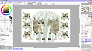
On the whole I thought this character would work rather well, his emotions can be defined easily enough, he’s simply done, and he’s very cute. But over all I still wasn’t very happy with how he turned out, and thought he looked more like a squirrel than anything else. So this is where I chose to do a 180 and start my character again, I knew, at least, that I knew what I wanted my character to look like and had the backing research and ideas to go along with.


I re-drew my character, this time with a change in the eyes and style, he would be more detailed still in a simple way. He had stronger and more defining lines, as well as being slightly chubbier, making him seem, straight away, as though food has a large role in his life and the main focus of his adventures.


I was a lot happier with these versions of my character than the previous ones, and once I added stripes to his tail and made his eyes black, it was much more obvious that he is a raccoon. He looks much happier and not so much typical Disney character, but more stereotypical for what I was planning to do with my animation storyline. This way I could also make my other characters all fit the same style in their own way. Instead of using the traditional front side and back, I’ve added an inbetweener so that the character displays more of himself to give the viewers more to look at. I also didn’t do an original sketch of the backside of him, instead I copied and edited the front drawing of him, making all his dimensions equal and in proportion, and found this was very effective in making everything stay the right shape and size, and much more simple than having to measure out.

Final Pieces: 


I then went onto lining and colouring my character board, now that I was happy with how my character looked. I re-used the background from my previous character board, as I thought that part was still very successful, and it contrasted well with the characters colours, making him more defined. This image shows roughly how I went about colouring him in,  where I applied the base colour and then added in overlaying colours with fur textures and blending tools, making him look a little more dynamic. After I had finished the drawings side of my character board, I went onto using the information I had created about my character, to fill in the blank spaces and give him more of a back story. I used his name, age, gender, strengths, weaknesses, beliefs, profession, diet and habits. With this information and the colour scheme added to the board, the final piece looks full of information, both visual and textual, which gives my character life and another dimension. I also selected a font called “Wolf’s Rain” which, I think, looks quite scratchy and jagged, which fits in well with the woodland and scavenger theme.
I then went on to creating the emotions of my character, and to do this I pretty much copied and pasted a
number of the raccoons faces from the front view, onto a new canvas and used a various amount of brushes to go over, cover, or open up his eyes, which is where most of his emotion comes from seeing as he has no mouth. I did find, however, that on some emotions such as drunk, silly and flirty, that it would be best for me to draw in a mouth so that the emotions could be defined better and not mixed up, which they easily could be. I found that this was very effective, when using just the eyebrows to show emotion.
The final and finished version of my character’s emotons sheet is, in my opinion, quite successful. The background works well against the colours of the character, which make the motions and the colours stand out great. I chose to label the emotions of my character, as the top three emotions are rather similar, and it would work better to label them all, and point out which ones weren’t as clear. My favourite emotions on this piece are “Silly” and “Annoyed,” because they show the most emotion, and aren’t ordinary, more common emotions like the rest. Once I had completed this, I went onto creating the more dynamic poses of my character. In these images I tried to make him have a bit more of an animal structure, than a human one, and I felt that this was a success because of how much more character it gave him. And it also made him look a bit more like a cirtter, and a scavenger than an unrealstic raccoon. I also chose to leave some of the designs blank, and showing how they were structured, which worked well and showed what thouhts and processes went into which part of him, making him come alive more. I also chose to colour in one of his designs, the biggest one, to show his colours, and how light and shadow would effect his fur and texture. This, I found, was a very good idea, as it gave my character the depth he needed to be taken more seriously and for the board to look more professional.


Evaluation: 

Overall, I am very pleased with how my character boards turned out. I put a vast amount of time into the original idea and wanted to keep it so much, without completely changing the storyline. I feel this version of my character looks a lot more defined, and has so much more character after being recreated to fit a more realistic style. The background, layout and text in all of my character boards fit well into one theme and differ enough to be distinguished, but not enough that they arent recognised as a set. If I were to change anything about this piece, had I had enough time, I would’ve used actual hand drawn sketches in my “Dynamic Poses” piece instead of using images I’d drawn out digitally.