Showing posts with label Illustrations. Show all posts

Thursday, 8 May 2014

Pictoplasma Festival - Berlin 2014

This year, we flew out to Berlin from Edinburgh in order to attend the 2014 Pictoplasma Conference in Berlin! which was held at the Babylon Theatre just outside the centre of the city. Although I was utterly terrified of flying/being outside/away from home/around strange people I hardly knew, I was determined to be optimistic!


One of the first talks I went to was "Buff Monster"'s. Buff Monster is a well known American Painter and Street Artist, whose main influences come from the oxymoron-esque combination of bright colours, the "cute" Japanese culture and heavy metal. And he has used this style of work to create huge pieces of street art, murals, painting and merchandise including prints, stickers, vinyl toys and plushes. I really enjoyed listening to Buff Monster's workflow and some of the reasoning behind his work, which is relatively simple with no main reasoning other than it's what he likes, and emphasises on the colour pink to show confidence, individuality and happiness which is consistent throughout his works. His work has definitely inspired me to start emphasising on the more grotesque and obscene elements which rarely show up in my work, and use inspiration from darker sources to get a variety of different outcomes.

Another Artist I enjoyed viewing was Tim Biskup, his work was very experimental and had a rather edgy visual effects on anyone who viewed it, which made it stand out vastly against the rest of the artists, as well as bring in a whole load of detail that could keep us looking at it for hours. I think the reason that Biskup's work is so successful is to do with the fact that he works with playful and vibrant psychedelic imagery. He creates this work by using a rather diverse selection of media such as silk-screening, textile production and rotocast vinyl. I think looking at Biskup's work has definitely influenced me to experiment with materials more, as well as style, as I think using mixed media in pieces and working with methods that are foreign to me, will help enhance my current style and even create a new one.

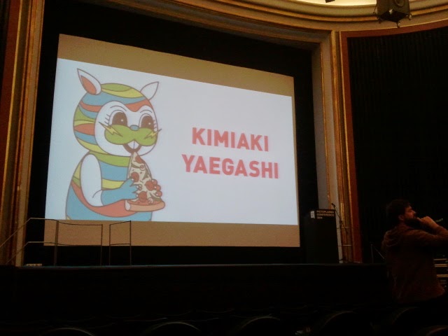
On the next day of talks, I got to see an artist that I'd never heard of before. Kimiaki Yaegashi is a well known Illustrator based in Tokyo, Japan. His work is rather simplistic with thick lines and bold colours and shapes. Admittedly I wasn't sure on whether or not I would find his work as appealing as some of the other artists, but I appreciated it none the less. However, once Kimiaki began going through his pieces it was clear that his work was greatly inspired by his heratige, as it included representations of well know Japanese spirits and that is what I appreciated most about his work. He also included his love of western productions, such as pizza, which, as we discovered later at his art show, was very much a part of his shows and gallery work.

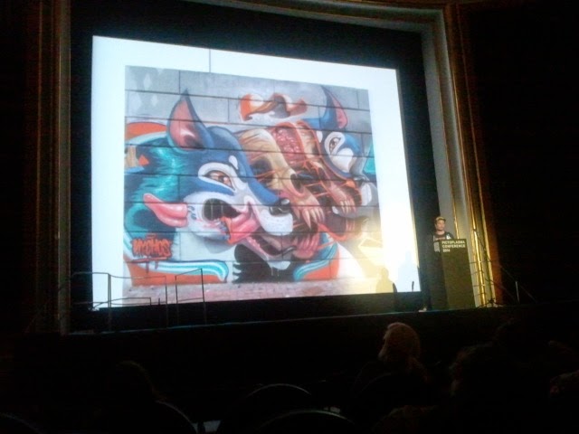
The last artist that I went to see, was Austrian street artist, Nychos. I had already been aware of Nychos' work through Instagram and was rather excited about seeing him explain in some detail about his work and why he does it. His work is heavily detailed and focuses, typically, on forms of bodies, and them being almost dissected in order to show all aspects of the figure. In this particular image, it shows a cartoon styled wolf getting his skin ripped off, then his bones split in two as well to show his insides. The images are always quite segmented and orderly which fits in well with the places they are usually sprayed upon, such as office or industrial buildings  and I think his work has inspired me to start trying out this style of art. Where I should concentrate on content and how I can make images such as this blend in well with their background.

Whilst in Berlin I also came across the work of Jeff Soto, who I had researched previously in my two years doing the Foundation Degree and for me it was rather surreal to see one of his pieces in real life. Although the image isn't really clear, you can see the amount of detail and effort that have gone into this piece, especially in the face and eyes where a huge amount of shading and highlights have been used, and it made me fully appreciate the time and effort it must take for street artists to create such heavily detailed work, in a short space of time and with the canvas being such a strange platform to work on.

Over all, the 6 day trip to Berlin was probably something I'm never going to get, and definitely worth the two hours of sweaty anxious hell that I endured on the plane there. I literally cannot wait for next year and I think with more confidence and research into a number of the artists, I'll be able to communicate to them better and possibly engage them in some sort of conversation. I also had so much fun exploring the city as well, because not only is it a rather easy city to get around, it is teeming full of culture and passionate people, and it's definitely somewhere I want to go back!


 Character "Selfie," gallery in an abandoned building!


Oh, and we also went to an aquarium where the entry required an awfully awkward family photo:


Friday, 11 April 2014

Illustration Friday submission.

I decided to do a piece for Illustration Friday, as part of my Live Project module. The theme for the week was "Survival," and that got me thinking quite deep about people struggling to survive as a result of other people, instead of that against something like climate or predators. 

I found that whilst painting this piece, I did a better job of it than I thought I would. I was able to use a much more thick style of paint and, especially on her face and eyes, I was able to fill in a lot more detail using just colours and not have to include lines to define her features. 
Once I finished this piece I then went and uploaded to the Illustration Friday page at Illustration Friday. And was really pleased with how it looked on an actual web page. 


I also decided to be a bit more daring and put it on Twitter, not really expecting anything to come from it, but just for people who follow me to see. And within about an hour I got a notification saying that the Illustration Friday's Twitter had retweeted it!I wasn't sure whether this was a big deal or not but I checked the their Twitter page and they only retweet maybe 3 - 4 submissions per week, so I was insanely pleased with that!


Friday, 28 March 2014

Live Project Week 1 Reflections.

UPDATES:


Monday 24th of March: Have been in correspondence with client and have brought up a number of ideas, which they approved of. Had the idea to bring up a Surfing theme behind the “7th Wave” name – will look into water patterns and surfboard designs to put into practice.

Tuesday 25th of March: Drew up 4 ideas, rather than the initial 3, in order to show specific details and changes through the ideas. I chose to go rather literal with what they asked for, rather than giving my own interpretation of it, as they were quite clear in what they asked for. 


Client was pleased with these outcomes, although I did urge them to point out ANYTHING they felt was out of place, and no offence would be taken it they didn't like or approve of anything. 


The same day they emailed me back which one they wanted and drew on necessary changes that they would like to be applied, which were few, but would make a large change to the layout of the logo. They also stated they would like the colours to be ever-so-slightly more vibrant against the grainy background.


Wednesday 26th of March: Once I had received the feedback from the client, I then went on to make the changes they had asked for, which included enhanced colour and changing position of a few of the individual pieces, and this was the final outcome. 

Thursday 27th of March: Went to meet up with the client in person with regards to another logo that they wanted me to design. From that meeting I took away the relevant information to design a logo based on a comic-book style, onomatopoeic piece. And straight away I looked into a mixture of  

Batman slapstick noises and the works of  Roy Lichtenstein. I came up with these ideas initially, but decided to go all out and look over  a range of fonts, baring in mind I had to stick with these colours. I also found that the image on the left was rather difficult to read, as the colours 
blended in together and the outline wasn't thick  enough to distinguish the letters from the background. 


I then decided to try out a different font, which could distinguish between the font and the background colour. I personally think that this font is so much better than the previously used one, however, a meet up with the client is still needed in order to see their opinion on it. 

Friday 28th of March: Met up with the client to discuss the ideas that I already had. And upon reflection, the client asked me to try out a few ideas from a totally opposite approach, something along the lines of a more clinical theme. 


Tuesday, 18 March 2014

Creating a Facebook Page.

Last summer I chose to try and get my work out there more and make a Facebook page for my Artwork; 


I was rather hesitant about making something like this, purely because of my lack of confidence and scared of what people I know in real life may think of it. But I thought I might as well try and say I've done it. 


Looking back on how many people have taken an interest in it, how many requests for Artwork, and friends I've made over-seas from this page, I think it has been a real success and probably one of the best decisions I've made this year. I also think that it has given me a lot more confidence with the work I produce, as well as taking any criticisms on my work.  

My Page can be found at https://www.facebook.com/EmmaInglisIllustrations


Friday, 14 February 2014

Project 4: Week 3 - Creating Mock Stills of DCM idents.

Using the knowledge I gained by researching DCM’s 2013 ident, I went on to make up some of my own versions using images on the internet. I decided to choose two different emotions and project them into an image based on the stills I took from the ident. I used DCM’s official logo as a template, then used Adobe Illustrator to create an exact cut out version of this. I then put this image onto Photoshop where I was able to create an almost exact replica of DCM’s stills.

The first emotion I chose was that of anger, as I thought that there would be a larger collection of those kinds of images on the internet. I chose the background image because it was such a dynamic and striking photo that would grab a lot of attention, and almost fit the emotion I wanted to portray exactly. Because of the image on the background being so dark, I knew I wanted a bright, but still an equally striking photo to go inside of the logo. I found an image of a cracked mirror, which was brilliant white in colour, but had stark black lines where the cracks had appeared. I thought that this worked really well as it not only showed the vast contrast (in colour) of the two images but also linked them together through the cracks and the dark background blending together. Almost as though the cause of the cracked mirror was the man in the background, which tells a great story when it comes to advertising.


Once my first attempt at making a still logo, in my opinion, worked out very well, so I then went onto create a second logo. I wanted this one to be the exact opposite of the previous one. I began my search looking for a warm and happy image, I wanted the image to represent a comfortable and happy state of peace. I found this image of a candle burning, and because the picture was full of oranges, browns, reds and yellows, I definitely got that warm glow and relaxed feeling from it. Going on from the warm and colourful background, I knew I wanted to add in a bright and exciting image in order to make the concept of the image more exciting and dynamic. I ended up searching for fireworks and ended up with a Catherine wheel – like picture, and because of the bright golden colour of the wheel, it makes the image look so much less static and adds so much more excitement and life to the image. I thought this worked really well as a full image, as the vast amount of emotions given off are really useful and bound to attract attention when it comes to advertising.

Sunday, 5 January 2014

Christmas Holidays - Illustrations!

In my spare time I was able to get down a few ideas I had for some of my own work. 
One of the ideas I put to work was a "Skinned Animal" piece, which I want to make into a series of work that would include a vast amount of different animals.

Here, I have created the drawing of a skinned cow atop of the models head, the eyes are missing, and originally I wanted the model to have the eyes of the animal, (I wanted to do the same with a deer and a wolf) and also took a lot of inspiration from Native American cultures. 


I also went onto using parts of the animal anatomy to create another piece.
The piece I named Octodreads, is aptly named because of the morphing tentacles going into the girls head.

I also went and created a piece that focused more on actually painting my images rather than creating more "airbrushed" looking pieces.
Straight away I found it a lot more challenging, but also more entertaining when it came to coloring. And i also feel as though this would be a step forward in my illustration skills.


Friday, 29 November 2013

Game of Thrones - Gallery Piece.


Last week I got asked if I wanted to put a piece of my work in a local gallery, I was both happy and anxious about this, as I'd never really put on of my pieces up in front of a lot of other people before, that and I had about half a week to do this. 
I decided to go with something that I was really enjoying at the moment and went for something Game of Thrones related.
Daenerys is my favourite character from it so, naturally, I went on to do this piece of her. Although I've seen a lot of artwork simply depicting her naked, I wanted to do something actually relevant to her story so I drew her as her title, "The Mother of Dragons."

The Piece stayed up for about 3 weeks and I had someone contact me asking if they could have it, and although I had already promised this piece to someone else. I was able to print off another and give out that one instead!


 UPDATE: 10th April 2014                               


I went back to this piece last week and made some small changes to the text and her shading, as I felt that towards the end of this piece, I rushed it in order to meet a deadline . This final piece puts my mind to rest and I'm now fully happy with the outcome!

Sunday, 24 November 2013

Gaining Recognition!

Through the summer and autumn I found a number of opportunities and chances to get my Artwork seen more around the area, as well as promote the more untraditional element found in my Art; 

June 20th 2013;
I was approached, online, by a local journalist Mel Miller, who was creating a piece of online written work, concerning the local Artist work in Berwick and the surrounding area, "Berwick and District Art Space," or BADAS as it has come to be known.
I felt rather shocked that someone was interested in my work, as I consider myself to be on the lower end of the scale when it comes to talent in my local area. However when I spoke to Mel she was very interested in how I create my work and the processes and tool that I use to complete them. As digital art isn't something that I consider to be widely known about or appreciated in a fairly isolated town in the Borders. She described the work that goes into digital art really well, and made it very clear for readers who may not have a single clue about  what digital art is. 

The link to the online article is Here, where she has featured two wonderful local artists who use a more traditional, but altogether unique means of practice, who I was honoured to have shared a space with on her article.
Two of my pieces that were featured in the article were ;


"Nebula Elf."                                                                               "Arwen Undomiel."


Although I consider these pieces to be old, and I have improved on my actual digital painting skills since then, at the time I was most proud of these two, and relieved very kind words from a collection of people.

Thursday, 24 October 2013

Project 2: Group Work / Animation Techniques - Rotoscoping/ Evaluation.

Playing Chinese Whipsers with Animation.
This was an exercise created to help us see how adventurous we could be when creating characters and putting them in motion.  As an experiment, the class decided to create a full cycle animation, using separate frames of an individual animation in itself. To begin with, we each started to draw a character, and inked it on the same page. After we did this, we then went over to the light boxes and passed each image to the left, meaning that the person to our left would be tracing over the image, but altering it slight as they did, in order to create a new frame. We all wanted to stretch out our morphing skills as far as they could go, ans as a result, created some rather obscure and disgusting outcomes!


7 Animations; 7 frames each.


Evaluation: 
I am really pleased with how this animation, as a class, worked out. Usually when it comes to drawing I love to have complete control over what I'm creating, and giving out my work for the rest of the class to enhance and build upon was definitely something of a trust exercise (or not in some cases.) We also were given this task to do with a limited time, which explains why the over all quality of the animation isn't to the best it could be. The way that totally different art styles have come together and made a pretty smooth metamorphosis series, shows how blending peoples' work together and exercises like this can show how someone can adapt to change create their own versions of something, to make a great outcome. 

Monday, 7 October 2013

Project 1: Week 2 Plan - 07/10/13

Project 1: Character Design.
For this project I am going to be creating my main character, which will star in my animated short that I am set to create later on this year. There aren't any limits when it comes to character creation, but for my on peace of mind, I want to keep my character simple and cute. 

Monday, 7th of October:
This week I will be concentrating on creating and finishing my character designs, as well as making the final character boards which will display and showcase my character, providing imagery and written pieces of information on my character. 


Days:
Monday 7th
Tuesday 
8th
Wednesday 9th
Thursday 10th
Friday
11th
Saturday
12th
Sunday 13th
Work to Complete
Begin initial sketches of my character. 
draw up different positions of character.
Eg. Emotions and standing/ sitting positions. 
Create coloured versions of my character/ try out different colours.

Create background images (SIMPLE) to go on character boards. 
Put character boards together!
Documentation. 
Reflection.

Tuesday, 1 October 2013

Project 1: Week 1 Plan - 01/10/13

Project 1: Character Design.
For this project I am going to be creating my main character, which will star in my animated short that I am set to create later on this year. There aren't any limits when it comes to character creation, but for my on peace of mind, I want to keep my character simple and cute. 

Monday, 30th of September:
This week I will be focusing mainly around research, in both animations and artwork regarding characters that I want to influence my own. I will look at a range of styles in order to get different aspects from each theme. 


Days:
Monday 30th
Tuesday 
1st
Wednesday 2nd
Thursday 3rd
Friday 
4th
Saturday 5th
Sunday 6th
Work to Complete
Brainstorm and decide on an over all "theme" for my animation. 
Look into Disney and Dream Works - Heroes.
Begin research into characters that I want to relate to my animation - Unlikely Heroes.
Look into small but mighty heroes!

Look into more comedic roles in characters.
(Create sketches on first ideas.)
Finish Research of characters and begin brainstorming aesthetics.
(Create sketches on first ideas.) 
Documentation. 
Reflection.

Friday, 22 March 2013

Paul Hess.

On friday the 22nd of March, we received a visit from a well  known children's book illustrator, Paul Hess. Hess has worked on a variety of book covers for children, mainly focusing on fairy tale and nursery rhyme stories than more contemporary ones.
We learned that Paul had studied in Sydney, Australia, and at first, wasn't sure what aspect of Art he would specialise in, as he first began under the pretences of being an Art Director (being in charge of an art gallery,) however he slowly moved onto illustration.
I found listening to Hess about the choices he made and the steps he took, benefited me greatly, as I find myself in a similar position to what he was in too.
 I found out a number of things I wanted to know, such as how to go about becoming a freelance illustrator, obtaining an agent who would organise work for me, who knew the right people to give me chances of work, and who would fit all work in a schedule for me, giving me time to break, concentrate on other pieces of work or spend time on holiday if there is any reason to be.

Paul Hess 1473
The more I listened to Paul explain his career to us, the more excited I got. I knew this would be along the lines of the career path I am aiming to take, and that's when he started to go through his process of work. 
Hess has worked in mainly watercolour for the majority of his work, showing us in great detail his process of using block colour, and slowly adding shading and texture to his work. 

He then went on to show us his digital art, which was in his distinguished style, as well as showing us his studio, his daily routines, showing how one doesn't just get up when they like and begin to draw. We also had a discussion about giving our ideas and reading into what we are going to create, as illustrators; this was done by the class receiving a copy of Hess's ghost story he had been working on, set in Africa and about two boys who take fruit from the tree that a ghost has made it's home. Using the description of the ghost in Hess's story, we were asked to create our own version of what we thought the ghost looked like;
  • "Hideous Creature with foaming red eyes, every other tooth missing, dead grass filled with bugs instead of hair, and a raspy, breathy laugh. " - These are my outcomes;


I feel as though I followed the description rather well; although I added limbs in the first image, and skinny ribs to the second, the images are over all terrifying and not what I'd consider putting in a child's book.