Showing posts with label Deer. Show all posts

Friday, 10 January 2014

Project 3: Week 7 - Filming my Animations.

 Filming my Animations. 
After having a bit of trouble with time when trying to film my animation with cinema 4D, I ended up giving After effects a go to see if it would fair any better. And truth be told I wish I had used this in the first place!


I found that using After Effects was just as complicated if you haven't used it before, but once I got the basic grasp of using the layers and merging folders together I absolutely loved using it. I found that my artwork could be seen more clearly and could be fully appreciated without me having to put in artificial lighting in the backgrounds.


I also found that using After Effects was a lot like Photoshop, as I should have sooner since their made by the same company. But using the camera tool was completely different and I think suited me much better, as all I needed to do was alter the image and record that movement as a keyframe on the timeline, instead of having to actually whop out a camera tool. 
I could also go back and edit mistakes easily, take out any random points I had made, or adjust any assets more easily in a 2 dimensional space and a 3 dimensional one. 
This is the set up of my second scene. I found that the colour scheme can be appreciated more in this set up and all of the colours, as well as the assets works really well this way.


Sunday, 5 January 2014

Christmas Holidays - Illustrations!

In my spare time I was able to get down a few ideas I had for some of my own work. 
One of the ideas I put to work was a "Skinned Animal" piece, which I want to make into a series of work that would include a vast amount of different animals.

Here, I have created the drawing of a skinned cow atop of the models head, the eyes are missing, and originally I wanted the model to have the eyes of the animal, (I wanted to do the same with a deer and a wolf) and also took a lot of inspiration from Native American cultures. 


I also went onto using parts of the animal anatomy to create another piece.
The piece I named Octodreads, is aptly named because of the morphing tentacles going into the girls head.

I also went and created a piece that focused more on actually painting my images rather than creating more "airbrushed" looking pieces.
Straight away I found it a lot more challenging, but also more entertaining when it came to coloring. And i also feel as though this would be a step forward in my illustration skills.


Friday, 1 November 2013

Project 2: Creating my Walk Cycles/ Final Products/ Evaluation.


In Preparation of creating my walk cycle loops for my final animation, I began by studying and
researching various ways that characters walk, and taking into consideration my characters weight, height and specific body parts which would have to be catered for. I searched through a vast amount of walk cycles and character designs, until I got to this little gem.
It seemed as though this walk cycle was perfect to help base my characters walk, for a number of reasons. The main one relating to the fact that I wanted my character to be rather short and podgy, and this little bird’s body was rather similar to what I had in mind. I also found that as I was drawing up my own characters body, based on this walk cycle, his belly would move from side to side, as if drawing all attention to it, and making it seem even bigger than it was.
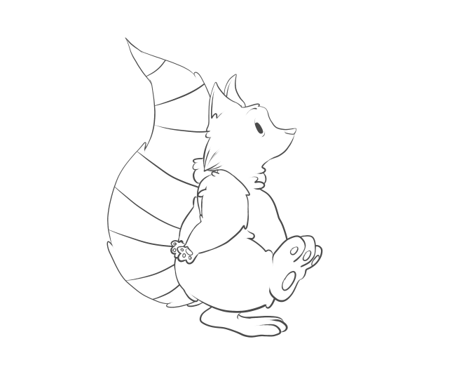
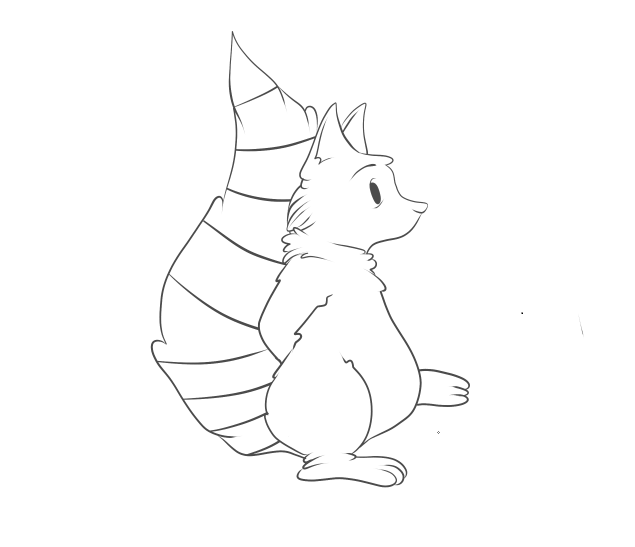
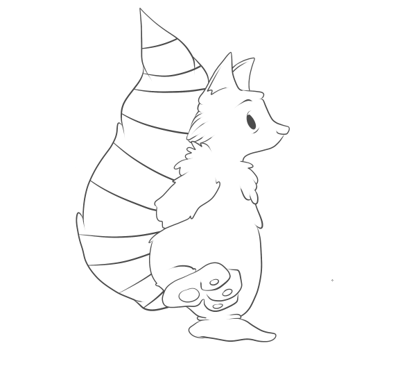
I found it a lot easier to simple draw my walk cycle images straight onto my computer, than doing them traditionally first, this saved so much time when it came to putting them all together. I used a stabilising tool on my pen work, which meant the lines would be a lot more smooth and flowing, and not sketchy like they would have come out by hand. I also chose to keep the outline of my character rather dishevelled, by changing the pressure that I applied to the pen. This made the line-work much more dramatic and somehow added a lot more character to the little raccoon, mostly by the lines being thicker at his arms and tummy, which made them seem more defined and thicker.  I didn’t have any specific difficulties when creating this walk cycle, there were minor changes to make with every frame there was to do. I did find, however, that I was able to keep the line definition the same throughout the cycle, and very easily as well, with thanks to the simple shape or my character.  Seeing as I had something as a base for my character’s walk cycle, it didn’t take me much time to complete my first walk cycle, and decided that because it had been so successful and so time efficient, I would use this loop, as an actual piece in my animation.


After I had created my first successful walk cycle, I decided I wanted to give it a go at colouring it;
I began by making a copy of my set of frames, and used the layering system to use colour on my individual frames, without going over the linework and ruining it. I wanted to start off using basic

colours and working my way up to doing complicated and more detailed colouring. However, I found that my characters colours were rather simple, and to try and simplify them anymore would cause them to not match the style of drawing I had done on them.
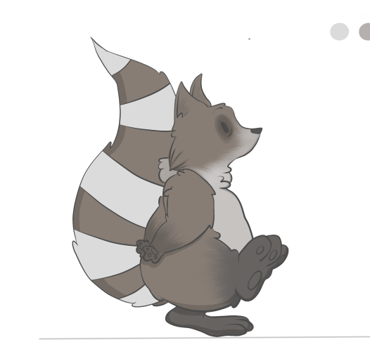
Here, it shows my first final frame that has been coloured. I used a base colour in grey/brown, then applied a light blue/white for the tail stripes and the fur on his belly and face. I used a textured brush which I edited to make look like fur, which I think worked very well on his body. I also added a dark grey to black colour on his feet, which worked very successfully and made them look a little dirty, which it turn makes him look more like a wild animal, rather than a house pet.
After I had applied all of his fur, and dark rings around his eyes to make him look both tired and more raccoon-like, I went on to create the shadow around his body. To do this, I made a new layer, turned the opacity down to about 19%, and turned the colour down to pure black. Then, with the stabiliser on max, and the pencil tool (which creates a clicked end) I went over the specific parts of his body.
This image shows in more detail how the shadow looks on the character. I think it works really well, when creating a shadow this way because of its opacity. The colours underneath are still very visible, whereas if I’d simply put a black line as the shadow it would have looked a lot less effective in my opinion. It also makes my character look a lot 3-dimensional, which brings him to life.
After I had completed all 14 of my walk frames, I then adjusted all of my images to ensure they were the same height, width and length, as my animation looked a little bit jumpy when put together.


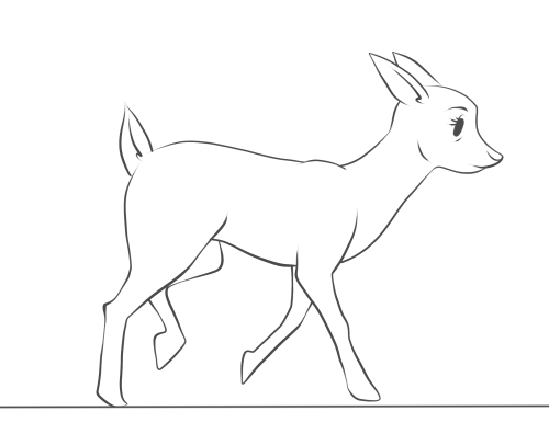
Once I had completed a walk cycle, and applied colour, I thought it best to try and work on one of my more difficult characters. That character being Lola, the fawn friend of Archie’s, and the soon to be killer of Archie as well. I really struggled with putting together an idea of how to make her walk, as I

haven’t ever really drawn deer that much, due to their complicated bodies and stances. So I sought help from gifs of Bambi, which I then broke down and used as bases for my own character! I found this way to be so helpful, and I quickly picked up the specific body parts and areas which would need most defining and emphasis, like I did with my first loop. I didn’t copy the cycle too accurately in this image, as they depict a fully gown deer walking, and I wanted to add the cautiousness and speed of a young fawn.
I found that using the pen tool, again, gave the sleek edge and soft lines that I wanted for this picture, as deer are seen as elegant creatures. I also found it rather challenging to keep an eye on what leg was moving where, and to ensure that I didn’t mess up the walk cycle. I probably could have made it easier for myself by shading or marking one of the front and back legs, to distinguish them from each other.
However, I persevered, and was able to create a full, and working, 20 frame cycle, which shows the deer cautiously walking forward. I added a tiny bit of a head dip to my character, which is JUST noticeable, but I didn’t want to create too much of a fuss with parts of the body other than the legs at the moment. One thing that did bug me about this walk cycle was that the images seemed to get bigger as the frames went on, which is probably down to my poor tracing skills. I managed to correct this by taking each individual frame and used the transform tool to make every single one of them the same size.
This walk cycle, I feel, took a lot more time and concentration than my first loop, simply because of the amount of body parts I had to control.  I feel as though I could easily apply colour to this cycle now, and try and work how the shadows would change as the character moves as well. And I also intend to use this cycle as a base for when I turn my fawn into a zombie like creature, were I can use each frame and edit it to my liking.


Once I had finished my first deer walk cycle, I then went on to using it as a base for the horrific makeover it was about to get;
I started off by drawing a simple line on my canvas, to ensure that all the frames were going to be the same size and I wouldn’t somehow make them all bigger as the frames go on.


I then copied and pasted one frame at a time, adjusting the size so that the character situated itself perfectly on the line. I then “went to town” on erasing parts of the body, and filling them in with different, horrific injuries that I plan on giving to the deer.
I started off with rather simple things, I added bags under her eyes to signify that she had become part of the nocturnal forest, much like her friend the raccoon. I then added a few drops of…whatever was eating her from the inside out, on her mouth and then added bits of the substance dripping from her mouth and swinging in a very mucus-like fashion. Although I’m aware that deer don’t really have eyebrows, or most artists try and blend them into their facial furry features, I altered hers to make her look more angry and demonic than before, and although the eyebrow looks rather placid in this image, it gradually becomes scarier as the frames go on.

I then went on to taking actual chunks out of her body. I knew from the moment I decided that she would “turn,” that I not only wanted to have parts of her body missing, I also wanted her to gain body parts, growths, tumours, boils – those kinds of things. So the gunge that’s eating her from the inside out, finally made an appearance and is shown to be dripping down her neck, were her windpipe and throat would be, I think this looks great, really effective and is actually not nice to look at, rather than making her still look cute with half her body missing, which is a common thing among this genre of animation.
After spending so much time working with her legs, I was a little apprehensive about changing them in any way, but one idea I did have, which kept her leg shape well, was to have a bone sticking out of one of the joints in her front and back legs. I drew a rather crude looking bone sticking out of the joint in her front leg, which looks rather horrible, along with the blood trailing down her leg to add to it. I also made her body lower itself, and go into a little dipping motion when it was time to put pressure on the leg, which I think will make it look a lot more effective and consistent with the frames.
After adding extra bones and effective the movement of my character, I then went on to make the biggest impact of my character;
I decided that to make my character a little bit more 3-dimensional, and I did this by removing almost half a side of my entire character. I wanted to have some ribs and organs showing, as well as making the skin look like it was peeling or dissolving away due to the substance inside of her. Although I want the skin to recede slowly, so I started off with a few cracks and splits in her skin, which I want to develop into larger splits and tears. Showing the ribs was easy enough, as I simple just had three separate spaces which curved down to meet the joint in her front leg.


I then went on to add multiple creases in the edges of her joints and skin. I think this makes the character look a lot more run down, almost as if she was sagging due to the nature of her health. I also added a kind of splat effect print on her hip, I think it kind of lightens the mood on the animation, as I don’t want this animation to be completely horrific! And the creases I think work so well, making her look so much more decrepit and shows just how much she is falling apart, and I also added a graze to the skin on her back leg, just so I could tell the difference between the legs.
The final product of my first frame of this walk cycle looks like this; I am very pleased with the detail I have managed to put into her and how I was able to make her health deteriorate steadily the more she moves. I have adjusted the majority of the frames to ensure that all of them are the same size and have went through her run cycle to make sure that the leg works well also, as I have intended to make it look as though it is limp when she runs. I then applied this to all 20 frames of my original walk cycle.


FINAL OUTCOMES:


Evaluation.
One a whole, I am really pleased with how all of my walk cycles have turned out. I used a digital format to create all of my frames and loops, which I haven’t done before, and experimented with making a gradual change to my character through the loop as well, which required a lot of attention to detail. I think I struggled slightly with keeping my frames all the same size and shape, because I was tracing and tracing and tracing an image constantly, and a result of this problem was the size of the deer's head changing and morphing slightly when in real life it would stick to the same size.
 If I were to do anything different, I would try and trace out all the frames by hand first, to ensure that they were all the same size, and would also have the much smoother and sleeker lines that my hand-done pieces tends to have. 

Monday, 21 October 2013

Project 2: Week 2 Plan - 21/10/13

Project 2: Alternative Techniques.
For this project I have been given the task of using alternative techniques in order to create cycles of my character's walk. I will aim to use this time to show specifically how my character will move, and emphasise any qualities he has which may affect how he moves, such as his belly or his tail.

Monday, 21st of October:
This week I will be concentrating on looking at putting my ideas and research to practice, and make up at least 3 walk cycles that I can present for hand-in. I will also look into colouring these animations, focusing on how light and shadows change as the character walks. 


Days:
Monday 21st
Tuesday 
22nd
Wednesday 23rd
Thursday 24th
Friday 
25th
Saturday
26th
Sunday 27th
Work to Complete
Begin sketches out character's defining features related to walk. 
Finish deer and raccoon walk cycle sketches
Digitally line all four walk cycles. 


Digitally line all four walk cycles. 
CAD Session & more research for blog alone. 

Documentation.
Colour up walk cycles at home.  
Reflection.
Colour up walk cycles at home. 

Sunday, 13 October 2013

Project 1: Character Design/ Final Pieces/ Evaluation


Before I decided on anything to do with my character, I tried my hand at a brainstorm to try and figure out what kind of animation story sounded best for me. I ended up choosing a mixture of two storylines, which were The Quest and Voyage and Return. It seemed that although they were the most likely to be popular out of all the options because of its simplicity. But I also felt that it would be the one that worked best for me. As soon as I decided on “Quest and Return,” I began think of random scenarios that would fit the chosen storyline. I had a number of ideas which all differed, but they all had one thing in common, the small overcoming the mighty, whether they be living things or metaphors, the “unlikely hero” was a story I wanted to stick with.


I eventually decided I wanted my character to be living, but not human, as I found that i tend to over-do human characters and I should go slightly out of my depth. I began to research animations that had an unlikley hero as the protagonist, which turned out to be literally every animation, so I had a lot of choice.
I ended up sticking to Disney for a while, as they had a selection of heroes and sidekicks who were deemed “unlikely,” and some of those were Dumbo, and his mouse friend, Meeko from Pochohontas, Flounder from the little Mermaid, The mice from Cinderella and the majority of characters from Whinnie the Pooh.  I also spent time looking at non-Disney related animations as well, such as “Please Say Something,” by David O’Reilly, the character Bartok from “Anastasia,” produced by Fox Animation Studios.

I was rather taken with how mischevious and anti-hero like Meeko was in Pochahontas, as he was mostly just ineterested in his tummy. He reminded me of Scrat from Ice Age, who only manages to follow the story because of his hungry for a large acorn. And from this I took away that my character should be something like a scavenger, someone who doesn’t really care about the dangers that they are in because of how hungry they are.
So from there I went on to look at characters that are specifically scavengers, such as the characters in Over the Hedge, Meeko from Pochahontas, Whinnie the Pooh and Gus from Cinderella. Who all
had rather similar qualities and a kind of care-free nature that makes them lovable, bearing in mind how much trouble they cause. I then went on to draw innitial sketches or what I thought the character should look like.


I went on to draw up my character digitally using Paint Tool SAI, using a freehand pen styled tool, to do a dark green shaded outline and I then used a textured brush to create the look of fur all over his body. I added shading using a stylised brush with jet black colour on a layer opacity of 21% which I felt gave the character a lot more depth. I went on to add a few facial expressions, which were copies of the original faces, which were then drawn over and edited to make a variation of differing emotions. These emotions ranged from happy, sad, angry, scared, shocked and embarrassed. I feel as though these expressions are rather successful because of how obvious they are, and considering my character has no mouth, all of the emotion remains in the eyes and eyebrows. I then started designing a background for my character board, I knew I wanted something very simple, and rustic looking, but it would still stand out against both the white background and my character.

I began by drawing a simple large circle that was the same height as the canvas. It was a moss shade of green which I think worked well to create a woodland theme in my character board. I then used a

textured brush which looked like broken chalk to draw in a selection of trees, both thick and thin, which made a spooky looking forest effect for the background, and the more pressure I applied to the pen tablet, the whiter and clearer the lines would be. I then added swatches of colour that had been used throughout the image as pantone refferences.
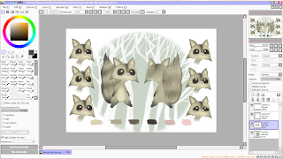
On the whole I thought this character would work rather well, his emotions can be defined easily enough, he’s simply done, and he’s very cute. But over all I still wasn’t very happy with how he turned out, and thought he looked more like a squirrel than anything else. So this is where I chose to do a 180 and start my character again, I knew, at least, that I knew what I wanted my character to look like and had the backing research and ideas to go along with.


I re-drew my character, this time with a change in the eyes and style, he would be more detailed still in a simple way. He had stronger and more defining lines, as well as being slightly chubbier, making him seem, straight away, as though food has a large role in his life and the main focus of his adventures.


I was a lot happier with these versions of my character than the previous ones, and once I added stripes to his tail and made his eyes black, it was much more obvious that he is a raccoon. He looks much happier and not so much typical Disney character, but more stereotypical for what I was planning to do with my animation storyline. This way I could also make my other characters all fit the same style in their own way. Instead of using the traditional front side and back, I’ve added an inbetweener so that the character displays more of himself to give the viewers more to look at. I also didn’t do an original sketch of the backside of him, instead I copied and edited the front drawing of him, making all his dimensions equal and in proportion, and found this was very effective in making everything stay the right shape and size, and much more simple than having to measure out.

Final Pieces: 


I then went onto lining and colouring my character board, now that I was happy with how my character looked. I re-used the background from my previous character board, as I thought that part was still very successful, and it contrasted well with the characters colours, making him more defined. This image shows roughly how I went about colouring him in,  where I applied the base colour and then added in overlaying colours with fur textures and blending tools, making him look a little more dynamic. After I had finished the drawings side of my character board, I went onto using the information I had created about my character, to fill in the blank spaces and give him more of a back story. I used his name, age, gender, strengths, weaknesses, beliefs, profession, diet and habits. With this information and the colour scheme added to the board, the final piece looks full of information, both visual and textual, which gives my character life and another dimension. I also selected a font called “Wolf’s Rain” which, I think, looks quite scratchy and jagged, which fits in well with the woodland and scavenger theme.
I then went on to creating the emotions of my character, and to do this I pretty much copied and pasted a
number of the raccoons faces from the front view, onto a new canvas and used a various amount of brushes to go over, cover, or open up his eyes, which is where most of his emotion comes from seeing as he has no mouth. I did find, however, that on some emotions such as drunk, silly and flirty, that it would be best for me to draw in a mouth so that the emotions could be defined better and not mixed up, which they easily could be. I found that this was very effective, when using just the eyebrows to show emotion.
The final and finished version of my character’s emotons sheet is, in my opinion, quite successful. The background works well against the colours of the character, which make the motions and the colours stand out great. I chose to label the emotions of my character, as the top three emotions are rather similar, and it would work better to label them all, and point out which ones weren’t as clear. My favourite emotions on this piece are “Silly” and “Annoyed,” because they show the most emotion, and aren’t ordinary, more common emotions like the rest. Once I had completed this, I went onto creating the more dynamic poses of my character. In these images I tried to make him have a bit more of an animal structure, than a human one, and I felt that this was a success because of how much more character it gave him. And it also made him look a bit more like a cirtter, and a scavenger than an unrealstic raccoon. I also chose to leave some of the designs blank, and showing how they were structured, which worked well and showed what thouhts and processes went into which part of him, making him come alive more. I also chose to colour in one of his designs, the biggest one, to show his colours, and how light and shadow would effect his fur and texture. This, I found, was a very good idea, as it gave my character the depth he needed to be taken more seriously and for the board to look more professional.


Evaluation: 

Overall, I am very pleased with how my character boards turned out. I put a vast amount of time into the original idea and wanted to keep it so much, without completely changing the storyline. I feel this version of my character looks a lot more defined, and has so much more character after being recreated to fit a more realistic style. The background, layout and text in all of my character boards fit well into one theme and differ enough to be distinguished, but not enough that they arent recognised as a set. If I were to change anything about this piece, had I had enough time, I would’ve used actual hand drawn sketches in my “Dynamic Poses” piece instead of using images I’d drawn out digitally.