
Before
I decided on anything to do with my character, I tried my hand at a brainstorm
to try and figure out what kind of animation story sounded best for me. I ended
up choosing a mixture of two storylines, which were The Quest and Voyage and
Return. It seemed that although they were the most likely to be popular out of
all the options because of its simplicity. But I also felt that it would be the
one that worked best for me. As
soon as I decided on “Quest and Return,” I began think of random scenarios that
would fit the chosen storyline. I had a number of ideas which all differed, but
they all had one thing in common, the small overcoming the mighty, whether they
be living things or metaphors, the “unlikely hero” was a story I wanted to
stick with.


I
eventually decided I wanted my character to be living, but not human, as I
found that i tend to over-do human characters and I should go slightly out of
my depth. I began to research animations that had an unlikley hero as the
protagonist, which turned out to be literally every animation, so I had a lot
of choice.
I ended up sticking to Disney for a while, as they had a selection of heroes
and sidekicks who were deemed “unlikely,” and some of those were Dumbo, and his
mouse friend, Meeko from Pochohontas, Flounder from the little Mermaid, The
mice from Cinderella and the majority of characters from Whinnie the Pooh. I also spent time looking at non-Disney
related animations as well, such as “Please Say Something,” by David O’Reilly,
the character Bartok from “Anastasia,” produced by Fox Animation Studios.
I
was rather taken with how mischevious and anti-hero like Meeko was in
Pochahontas, as he was mostly just ineterested in his tummy. He reminded me of
Scrat from Ice Age, who only manages to follow the story because of his hungry
for a large acorn. And from this I took away that my character should be
something like a scavenger, someone who doesn’t really care about the dangers
that they are in because of how hungry they are.
So
from there I went on to look at characters that are specifically scavengers,
such as the characters in Over the Hedge, Meeko from Pochahontas, Whinnie the
Pooh and Gus from Cinderella. Who all
had rather similar
qualities and a kind of care-free nature that makes them lovable, bearing in
mind how much trouble they cause. I then went on to draw innitial sketches or
what I thought the character should look like.
I went on to draw up
my character digitally using Paint Tool SAI, using a freehand pen styled tool,
to do a dark green shaded outline and I then used a textured brush to create
the look of fur all over his body. I added shading using a stylised brush with jet
black colour on a layer opacity of 21% which I felt gave the character a lot
more depth. I went on to add a few facial expressions, which were copies of the
original faces, which were then drawn over and edited to make a variation of
differing emotions. These emotions ranged from happy, sad, angry, scared,
shocked and embarrassed. I feel as though these expressions are rather
successful because of how obvious they are, and considering my character has no
mouth, all of the emotion remains in the eyes and eyebrows. I then started
designing a background for my character board, I knew I wanted something very
simple, and rustic looking, but it would still stand out against both the white
background and my character.

I began by drawing a
simple large circle that was the same height as the canvas. It was a moss shade
of green which I think worked well to create a woodland theme in my character
board. I then used a
textured brush which looked like broken chalk to draw in a
selection of trees, both thick and thin, which made a spooky looking forest
effect for the background, and the more pressure I applied to the pen tablet,
the whiter and clearer the lines would be. I then added swatches of colour that had been used
throughout the image as pantone refferences.
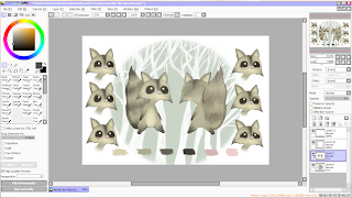
On the whole I thought this character would work rather
well, his emotions can be defined easily enough, he’s simply done, and he’s
very cute. But over all I still wasn’t very happy with how he turned out, and
thought he looked more like a squirrel than anything else. So this is where I
chose to do a 180 and start my character again, I knew, at least, that I knew
what I wanted my character to look like and had the backing research and ideas
to go along with.


I re-drew my character, this time with a change in the eyes
and style, he would be more detailed still in a simple way. He had stronger and
more defining lines, as well as being slightly chubbier, making him seem,
straight away, as though food has a large role in his life and the main focus
of his adventures.

I was a lot happier with
these versions of my character than the previous ones, and once I added stripes
to his tail and made his eyes black, it was much more obvious that he is a
raccoon. He looks much happier and not so much typical Disney character, but
more stereotypical for what I was planning to do with my animation storyline.
This way I could also make my other characters all fit the same style in their
own way. Instead of using the traditional front side and back, I’ve added an
inbetweener so that the character displays more of himself to give the viewers
more to look at. I also didn’t do an original sketch of the backside of him,
instead I copied and edited the front drawing of him, making all his dimensions
equal and in proportion, and found this was very effective in making everything
stay the right shape and size, and much more simple than having to measure out.
Final Pieces:


I then went onto lining and colouring my character board, now
that I was happy with how my character looked. I re-used the background from my
previous character board, as I thought that part was still very successful, and
it contrasted well with the characters colours, making him more defined. This
image shows roughly how I went about colouring him in, where I applied the base colour and then added
in overlaying colours with fur textures and blending tools, making him look a
little more dynamic. After I had finished the drawings side of my character
board, I went onto using the information I had created about my character, to
fill in the blank spaces and give him more of a back story. I used his name,
age, gender, strengths, weaknesses, beliefs, profession, diet and habits. With
this information and the colour scheme added to the board, the final piece
looks full of information, both visual and textual, which gives my character
life and another dimension. I also selected a font called “Wolf’s Rain” which, I
think, looks quite scratchy and jagged, which fits in well with the woodland
and scavenger theme.
I then went on to creating the emotions of my character, and
to do this I pretty much copied and pasted a
number of the raccoons faces from
the front view, onto a new canvas and used a various amount of brushes to go
over, cover, or open up his eyes, which is where most of his emotion comes from
seeing as he has no mouth. I did find, however, that on some emotions such as
drunk, silly and flirty, that it would be best for me to draw in a mouth so
that the emotions could be defined better and not mixed up, which they easily
could be. I found that this was very effective, when using just the eyebrows to
show emotion.
The final and finished version of my character’s emotons
sheet is, in my opinion, quite successful. The background works well against
the colours of the character, which make the motions and the colours stand out
great. I chose to label the emotions of my character, as the top three emotions
are rather similar, and it would work better to label them all, and point out
which ones weren’t as clear. My favourite emotions on this piece are “Silly”
and “Annoyed,” because they show the most emotion, and aren’t ordinary, more
common emotions like the rest. Once I had completed this, I went onto creating
the more dynamic poses of my character. In these images I tried to make him have
a bit more of an animal structure, than a human one, and I felt that this was a
success because of how much more character it gave him. And it also made him
look a bit more like a cirtter, and a scavenger than an unrealstic raccoon. I
also chose to leave some of the designs blank, and showing how they were
structured, which worked well and showed what thouhts and processes went into
which part of him, making him come alive more. I also chose to colour in one of
his designs, the biggest one, to show his colours, and how light and shadow
would effect his fur and texture. This, I found, was a very good idea, as it
gave my character the depth he needed to be taken more seriously and for the
board to look more professional.

Evaluation:
Overall,
I am very pleased with how my character boards turned out. I put a vast amount
of time into the original idea and wanted to keep it so much, without
completely changing the storyline. I feel this version of my character looks a
lot more defined, and has so much more character after being recreated to fit a
more realistic style. The background, layout and text in all of my character
boards fit well into one theme and differ enough to be distinguished, but not
enough that they arent recognised as a set. If I were to change anything about
this piece, had I had enough time, I would’ve used actual hand drawn sketches
in my “Dynamic Poses” piece instead of using images I’d drawn out digitally.

 I found this task rather daunting, as there was no denying it would take a long time, and instead made his legs a lot smaller and decided that sitting could well be just standing if drawn right.


