Friday, 29 November 2013

Project 3: Creating my characters and assets for Scene 1.


Creating assets for Scene 1.


I started off this part of the project by creating the most prominent part of the scene: The forest. I knew that I wanted a black background to give off the full potential of the colour scheme that i have applied to this animation, so the trees I have chosen to do are all rather vibrant against a black background. I've also taken into account the fact that these trees themselves need to show depth of the scene and so I have made them slightly darker, the further back they go. 

From my initial plans you can see I have still kept as much detail in the trees as I can, this is to ensure that the animation looks the highest quality I can make it, and gives off a rather professional look to it. 

I have also added spiky looking flicks at the end of these trees, and the reason for this is because I'm aware that these trees wouldn't look at good if they we


I also made some little bits and pieces to go in my forest, as I felt it would just be a bit boring and repetitive if there were JUST trees. 


Game of Thrones - Gallery Piece.


Last week I got asked if I wanted to put a piece of my work in a local gallery, I was both happy and anxious about this, as I'd never really put on of my pieces up in front of a lot of other people before, that and I had about half a week to do this. 
I decided to go with something that I was really enjoying at the moment and went for something Game of Thrones related.
Daenerys is my favourite character from it so, naturally, I went on to do this piece of her. Although I've seen a lot of artwork simply depicting her naked, I wanted to do something actually relevant to her story so I drew her as her title, "The Mother of Dragons."

The Piece stayed up for about 3 weeks and I had someone contact me asking if they could have it, and although I had already promised this piece to someone else. I was able to print off another and give out that one instead!


 UPDATE: 10th April 2014                               


I went back to this piece last week and made some small changes to the text and her shading, as I felt that towards the end of this piece, I rushed it in order to meet a deadline . This final piece puts my mind to rest and I'm now fully happy with the outcome!

Monday, 25 November 2013

Project 3: Week 4 Plan - 25/11/13

Project 3: Digital Skills Application.
For this project I have been given the task of showcasing my digital skills by making an animated short, along with any other digital work that I feel shows my skills to their full potential. 

Monday, 25th of November:
This week I will be going back to my main project and to the beginning stages of creating the artwork for my animation. I will begin by doing this scene by scene, creating the characters, walk cycles and scenery that's needed. 


Days:
Monday 25th
Tuesday 
26th
Wednesday 27th
Thursday 28th
Friday 
29th
Saturday
30th
Sunday 1st
Work to Complete
Start sketches of characters in new walk cycles, and frames.
SCENE 1
Continue with drawing up characters and put them into digital format.
SCENE 1
Finish off digital images and walk cycles of characters
SCENE 1
Start drawing up scenery in sketches 
SCENE 1
CAD session 
- keep blog up to date. 

 Documentation.   + Hand in to LoopDeLoop
Reflection

Sunday, 24 November 2013

Siaman Chow - Art.


Art.


This GIF, or loop cycle animation has been created by Saiman Chow. I was drawn to this piece in particular because of the style it was done in, It differs from the rest of the animations I have researched because of the fact it looks thoroughly sketchy and hand drawn.This image only lasts for a few seconds, but it is very clear to make out what happens during those few seconds. The face of a man, presumed to be Siaman himself? slowly starts to deteriorate and eventually turns into a skull, and for some reason I get a glimpse of the diamond skull associated with Damien Hirst.
 It also focuses on the aspect of deterioration, an aspect which is highly relevant to my project at the moment. There is constant movement in the loop, so t is easy to pass off any irregularities as part of the animation, which is a simple but effective aspect to use. I love how the film is rather gritty, but still moves in a flowing motion and doesn't have any particular jump or skips in the sequence. Chow also manages to cross realism with fantasy, as he is able to make parts of the face vanish, instead of dropping off or crumbling away, this applies mostly to the glasses on his and ears, which i think works rather well. However, if I were to criticize the animation in anyway, the only change i would make, personally, would be to make the image have more gore like features as the face slowly vanishes into the skull, particularly from the nose and eyes.

Gaining Recognition!

Through the summer and autumn I found a number of opportunities and chances to get my Artwork seen more around the area, as well as promote the more untraditional element found in my Art; 

June 20th 2013;
I was approached, online, by a local journalist Mel Miller, who was creating a piece of online written work, concerning the local Artist work in Berwick and the surrounding area, "Berwick and District Art Space," or BADAS as it has come to be known.
I felt rather shocked that someone was interested in my work, as I consider myself to be on the lower end of the scale when it comes to talent in my local area. However when I spoke to Mel she was very interested in how I create my work and the processes and tool that I use to complete them. As digital art isn't something that I consider to be widely known about or appreciated in a fairly isolated town in the Borders. She described the work that goes into digital art really well, and made it very clear for readers who may not have a single clue about  what digital art is. 

The link to the online article is Here, where she has featured two wonderful local artists who use a more traditional, but altogether unique means of practice, who I was honoured to have shared a space with on her article.
Two of my pieces that were featured in the article were ;


"Nebula Elf."                                                                               "Arwen Undomiel."


Although I consider these pieces to be old, and I have improved on my actual digital painting skills since then, at the time I was most proud of these two, and relieved very kind words from a collection of people.

Project 3: Week 3 Reflections.

Week 3 Reflections. 


Days:
Monday 18th
Tuesday 
19th
Wednesday 20th
Thursday 21st
Friday 
22nd
Saturday
23rd
Sunday 24th
Work to Complete
Listen to the music provided by LoopDe
Loop.
Begin drawing up a character in college and digitally at home. 
Finish digital drawing of character.


Begin animating character  on After Effects. 
Look into puppet pins!
CAD session 
- keep blog up to date. 

 Documentation.   + Hand in to LoopDeLoop
Reflection


This week I took part in a smaller project, separate to my main project, and created a small looped animation for a competition. 

Monday 18th November: I listened to and chose which piece of music I wanted to use for my animation. 

Tuesday 19th November: Drew up a character straight away which was a little cat with headphones on. A pretty simple character which will be easy enough to animate.


Wednesday 20th November: Finished up a digital drawing of my character with separate body parts that I could track to the body and move with the music.

Thursday 21st November: Began animating my character in separate pieces, with the body first, and was also able to make the character blink and smile at certain points.


Friday 22nd November: CAD session and filled in blog!


Friday, 22 November 2013

LoopDeLoop Competition Entry/ Evaluation.

During the week we had a small surprise live brief;
We were asked to take part in a competition, based in Australia, named LoopDeLoop! Which consists of entries from all over the world which are all examples of looped animations. 
We were given the week-long task of designing, creating and animating a small animation Loop to go with a subject, and a sample of chosen music.
There were a set of rules we had to follow in order for our loops to be considered for the competition, and these rules were;

  • The animation loop must be 24 frames per second.
  • It must be designed and animated to the beats of one of four samples of music chosen by you.
  • It must be made and rendered on a green screen-like background (#00FF00.)
  • No shadows and the character must have a crisp and clean silhouette.
  • All loops must be submitted under the appropriate formats.
  • Can be as long as you like, as long at it loops!
The track I chose was very up-beat and quirky, and was my favourite out of all of the songs, and it made the think of a very cute and lovable atmosphere.
 The character that I created to go with this song was a little cat with rather large headphones on. I made the cat look rather techno-like, to match the song choice I made, as well as keeping the colours rather light and "cute" in order to keep up this cheerful appearance.
I made this animation using Adobe AfterEffects, where the character was drawn in a digital program (Paint Tool Sai) and I then put all of the separate drawn pieces into AfterEffects and animated the cat manually through grabbing and moving parts of her body.
Before I did any of this, I had put the track into After Effects first, and then worked out the beats and timings on After Effects' timeline and was able to map out specific parts that my animation would need to move.

Here is my finished, small animation loop;


Evaluation.
I was pleased to have a small break from the big project we were undergoing and doing something small and fresh was a big break for us. I found this project both fun and rather challenging at the same time, as it was my first time using After Effects. I chose something cute and small because I have a lot of experience with that kind of subject, and I chose a very simple design which for me is rather unusual, but I did feel it would help with making the movements of my character a lot smoother and work better all round. If I had to have done anything differently, I would have taken a bit more time ensure that puppet pins and pieces of her body were more intact and running smoothly than on what she looks like. But overall I'm quite pleased with how my animation turned out, I think had I known more about After Effects and also taking to account that the project was only a week long, I could have done slightly more to enhance my animation and make the character do a little bit more with regards to movement.


Monday, 18 November 2013

Project 3: Week 3 Plan - 18/11/13

Project 3: Digital Skills Application.
For this project I have been given the task of showcasing my digital skills by making an animated short, along with any other digital work that I feel shows my skills to their full potential. 

Monday, 18th of November:
This week I will be taking a short break from my current project, and taking part in a short live brief with the class. The live brief is that of an Australian competition called LoopDeLoop.


Days:
Monday 18th
Tuesday 
19th
Wednesday 20th
Thursday 21st
Friday 
22nd
Saturday
23rd
Sunday 24th
Work to Complete
Listen to the music provided by LoopDe
Loop.
Begin drawing up a character in college and digitally at home. 
Finish digital drawing of character.


Begin animating character  on After Effects. 
Look into puppet pins!
CAD session 
- keep blog up to date. 

 Documentation.   + Hand in to LoopDeLoop
Reflection

Sunday, 17 November 2013

Project 3: Week 2 Reflections.

Week 2 Reflections.


Days:
Monday 11th
Tuesday 
12th
Wednesday 13th
Thursday 14th
Friday 
15th
Saturday
16th
Sunday 17th
Work to Complete
Start digital work on 
first storyboard.
Finish first storyboard and begin second.
Finish second storyboard and begin third


Clean up all 3 storyboards and create small animatic
(IF I HAVE TIME.)
CAD session 
- keep blog up to date. 

 Documentation.   
Reflection


This week I concentrated on the creation of my storyboards, and ensuring that the story was clear through visuals alone. 

Monday 11th November: Completed all of the line work for my first storyboard and began to colour at home.  

Tuesday 12th November: Finished first and second storyboard at college and started the third at home.

Wednesday 13th November: Re-done my third storyboard as I wasn't happy with the characters on it.

Thursday 14th November: Finished all three storyboards and began sketching up characters and walk cycles instead of animatic.


Friday 15th November: CAD session and filled in blog!


Friday, 15 November 2013

Storyboards/ Explanation/ Evaluation.

Creating and finalising my Storyboards;


 My storyboards depict the travels of a small Raccoon named Archie, who goes on an adventure to find the delicious pie, who's enticing scent makes Archie go against his better judgement, and goes exploring in search of the source of the smell. 


He begins by going to find his close friend Lola, a fawn, who is confined to the "daytime" forest, and tries to encourage her to join him on his travels. And against their better judgement, they travel into the nocturnal forest alone together. 
During their journey, a set of thorns catch onto the skin of Lola, who, as a "daytime animal" will react badly to that.


As they continue their journey, the camera focuses more on Archie, where he begins to hear strange noises. After a while he turns around to address Lola, when he's met with a gruesome sight;
Lola has become putrid and disfigured, a reaction cause by the catch of thorns.
It is then ambiguous as to what happens to Archie and Lola, as the camera pans up towards the top of the trees, where "The End" title appears. This leaves an open ending and plenty of options for the audience.


Evaluation.
 Over all I am rather pleased with how my storyboards have turned out. I completed these storyboards straight away digitally, and that is something I haven't tried before, as usually I have sketches them out by hand first. I did come into some problems whilst creating these storyboards, mainly because of the size of the panels, and my inability to let myself draw something small and less detailed than it needs to be. I did overcome these issues however, especially with the trees in the forest. I was able to make them look rather detailed but maintain a decent size to them as well. I am particularly pleased with the colour scheme I chose for this animation too, as it is out of my usually comfort zone with keeping things simple and rather plain looking, as well as my lack of outline on the scenery, which is something I have never attempted...ever!
So over all I'm happy with the out-come of this part of my project, although I think if I have time, I will create a slightly higher quality version of them, just to make them more professional looking.


Monday, 11 November 2013

Project 3: Week 2 Plan - 11/11/13

Project 3: Digital Skills Application.
For this project I have been given the task of showcasing my digital skills by making an animated short, along with any other digital work that I feel shows my skills to their full potential. 

Monday, 11th of November:
This week I will be focusing on the creation of my storyboard which will help me with regards to creating my animation. I will be focusing on timing, colour schemes and camera angles in these storyboards as well. 


Days:
Monday 11th
Tuesday 
12th
Wednesday 13th
Thursday 14th
Friday 
15th
Saturday
16th
Sunday 17th
Work to Complete
Start digital work on 
first storyboard.
Finish first storyboard and begin second.
Finish second storyboard and begin third


Clean up all 3 storyboards and create small animatic
(IF I HAVE TIME.)
CAD session 
- keep blog up to date. 

 Documentation.   
Reflection

Sunday, 10 November 2013

Project 3: Week 1 Reflections.

Week 1 Reflections.


Days:
Monday 4th
Tuesday 
5th
Wednesday 6th
Thursday 7th
Friday 
8th
Saturday
9th
Sunday 10th
Work to Complete
Begin sketches in book of scenery and small panels for storyboard.
Look  for real life images:
trees
woods
Disney? - Bambi
Begin higher quality sketches of trees and woodland area in sketchbook


Begin higher quality sketches of trees and woodland area in sketchbook
CAD session 
- keep blog up to date. 

 Documentation.   
Reflection


This week I planned on starting to design my storyboards that I would use as a basis to create my animation. 

Monday 4th November: I did light sketches of woodland areas, focusing on trees and shading them. 

Tuesday 5th November: Collected visuals of paintings (Not photos) of woodland areas to get different colour schemes - green, blue and purple were most popular.

Wednesday 6th November: Began higher quality sketches of trees to use for my storyboards.

Thursday 7th November: Began higher quality sketches of trees to use for my storyboards.


Friday 8th November: CAD session and filled in blog!


Friday, 8 November 2013

Project 3: Beginnings of My Storyboard


Creating Visuals for my Storyboard. 
I have taken inspiration from both online and real life sources in order to recreate a stylised set of scenery pieces that I plan on using in my storyboard, and eventually my animation.


 For this piece, I went out and sought after first hand visuals that I could use to bring a semi-realistic style to my drawings, purely to test and see what kind of visuals would be easier to recreate for my animation. I went against my usual style of drawing and used rather square and parallel lines, bringing out angles in the trees and adding depth to the picture, which is a factor I want to take into consideration when creating a forest in an animation. 


 Once I had tried and tested a more realistic view on groups of trees, I then went onto gather images of trees that I knew would work well my usual  style of art. I went looking specifically for types of trees that were twisted and morphed into peculiar shapes. Most of these kinds of trees seemed to be found in European countries such as France and Germany, which, coincidentally, is where a lot of fairy tales such as Hansel and Gretel and Little Red Riding Hood originate from. 
On this particular image, I focused on thicker lines and plenty of shading in order to create a more dynamic setting. The trees resemble a much more fictional style, where faces of words could easily be hidden among the swirls and patterns. I drew these trees whilst watching Disney's Snow White, which also links in well to the evil presence where faces and words could be brought into them easily and depict a negative entity. 


Taking both of these styles into account, I then went ahead and began creating my own version of these tress, completely from my own imagination with no visual help. I knew I wanted to take the line structure and thin details from the first set of trees and use that as my own, as well as using the light and heavy shading techniques from the second set of trees and blending that in as well. 
And this was the result! I'm really pleased with how these trees turned out, the bold outline blending into the smaller and weaker lines is probably my favourite thing about this image, as it shows everything down to the last detail, without making it over crowded or messy. I went over some of the lines down by the trunk, however, in order to show off a more sturdy bottom end to the trees and not make them look flimsy or unsupported.

Evaluation.

Although I do love how detailed and delicate these trees look, in something like my storyboards, which are only going to be A3 sized, I think there is just too much detail in them and I would need to simplify them. I do still plan on using the original shape, and bringing in defining lines and shading in order to make them more 3 dimensional, and I would be more likely to use these if I were to make a storybook or little leaflet on this animation.


Thursday, 7 November 2013

Jeff Soto; Telephone Poles – Abu Ghraib (2008.)

Another one of Soto’s works, that I feel inspire me, is “Telephone Poles – Abu Ghraib,” for a number of reasons.
The concept of this illustration, I feel, is to focus on a number of underlying messages that cause controversy around the world, and still manage to possibly associate itself with a well-known children’s story “Peter Pan.” I feel as though I could take this subject of children’s storied and relate them to problems around the world, related to religion, terrorism, money and social views on other cultures.

The style of the illustration is rather miss-matched in my opinion; a cluster of images all done rather differently to Soto’s other work. It gives off a strong feel of confusion, obviously related to both religious and political views which would explain some inner conflict between morals and duty. I feel as though this could give me insight into how to include and incorporate other images into my pieces of work, without simply placing them around or next to the main character or center piece. This would also allow me to fill up my pages of work rather than giving them a simple background, which would make my work look a lot more professional and effective.

 I also feel that I could be inspired by his work because of the way he lines his work: he almost does the exact opposite to what I normally do and has very sketchy and disjointed lines to outline his work. This gives off the feeling of anger or quickness, which can make the image look vastly more effective than having clean and flowing lines, especially for the subject that I think the image is meant to depict. It would also help the time scale and development of my ideas, as it would save me time on outlining my work and would give me a better chance to concentrate on my colour scale, as I have trouble deciding on a typical colour palette, while my drawings are lined in simple black.

Monday, 4 November 2013

Project 3: Week 1 Plan - 04/11/13

Project 3: Digital Skills Application.
For this project I have been given the task of showcasing my digital skills by making an animated short, along with any other digital work that I feel shows my skills to their full potential. 

Monday, 4th of November:
This week I will be concentrating on making my storyboards up for my animation, giving timings, camera angles and any small notes that the animation needs. 


Days:
Monday 4th
Tuesday 
5th
Wednesday 6th
Thursday 7th
Friday 
8th
Saturday
9th
Sunday 10th
Work to Complete
Begin sketches in book of scenery and small panels for storyboard.
Look  for real life images:
trees
woods
Disney? - Bambi
Begin higer quality sketches of trees and woodland area in sketchbook


Begin higer quality sketches of trees and woodland area in sketchbook
CAD session 
- keep blog up to date. 

 Documentation.   
Reflection

Sunday, 3 November 2013

Project 2: Week 3 Reflections.

Week 3 Reflections.


Days:
Monday 28th
Tuesday 
29th
Wednesday 30th
Thursday 31st
Friday 
1st
Saturday
2nd
Sunday 3rd
Work to Complete
Complete 4th walk cycle - colour if I have time. 
Transfer all SAI files to PSD and animate them on Photoshop.
Print out 3 character boards and put walk cycles on a disk. 


collect all work, folders and submission forms
HAND IN!

 BREAK   
Reflection

This week I set out to complete any left over work, my last walk cycle, and then hand in all of my work from the two projects at the same time. 

Monday 28th October: I drew up and digitally lined my last walk cycle, which was the zombie fawn. Had trouble with moving legs at different times, and body had little issues to fix. 

Tuesday 29th October: Moved all of my files to psd where I uploaded them to Photoshop and animated them using Photoshop's animated timeline. 

Wednesday 30th October: Printed out all of my character boards and written work for both projects. I put all digital work on a disk. 

Thursday 31st October: Sorted out my two projects into two separate zip folders and printed out my submission forms  to sign. 


Friday 1st November: HAND IN!!

Saturday, 2 November 2013

Fluorescent Hill - Joey


Joey.


Here is another animation that has been created by Fluorescent Hill, Joey.  The thing that caught my eye straight away about this animation begins right at the very start, where a detailed and delicate header is drawn out in a real time effect, which looks simply amazing. It also adds a sense of age and tradition to the story even though it is not yet known what it's about. I chose this piece because it is the complete opposite of  "Spacious Thoughts," in many different ways. To start with, it would appear that this animation has been created in either 2D or 2.5D, a big change from full 3D that Spacious Thoughts was developed in. The main element of this animation appears to be rotoscoping (possibly traditionally or digitally done) and has a sepia tone running through it, which makes the film look classic, or vintage. There also seems to be a lens glare in the middle of the screen, which also adds a home-video kind of effect to the film as well. The storyline of this animation is rather strange as it begins with a stop motion piece of an old storybook opening into the beginning of the song. It shows a fox and a crow, in the wild, begin to fight and it results in the crow begin decapitated with smaller crows flying out of its throat. It then flashes onto a fox trying to fit into everyday society, with crows replacing humans, I find this quite odd but entertaining at the same time, the video looks as though it should be more gruesome and grotesque than it is, and gives a tingly and shivery sensation, which appears to be heightened by the creepy indie music that its playing along to.


Friday, 1 November 2013

Project 2: Creating my Walk Cycles/ Final Products/ Evaluation.


In Preparation of creating my walk cycle loops for my final animation, I began by studying and
researching various ways that characters walk, and taking into consideration my characters weight, height and specific body parts which would have to be catered for. I searched through a vast amount of walk cycles and character designs, until I got to this little gem.
It seemed as though this walk cycle was perfect to help base my characters walk, for a number of reasons. The main one relating to the fact that I wanted my character to be rather short and podgy, and this little bird’s body was rather similar to what I had in mind. I also found that as I was drawing up my own characters body, based on this walk cycle, his belly would move from side to side, as if drawing all attention to it, and making it seem even bigger than it was.
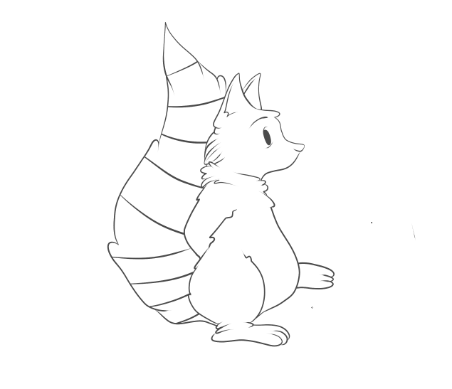
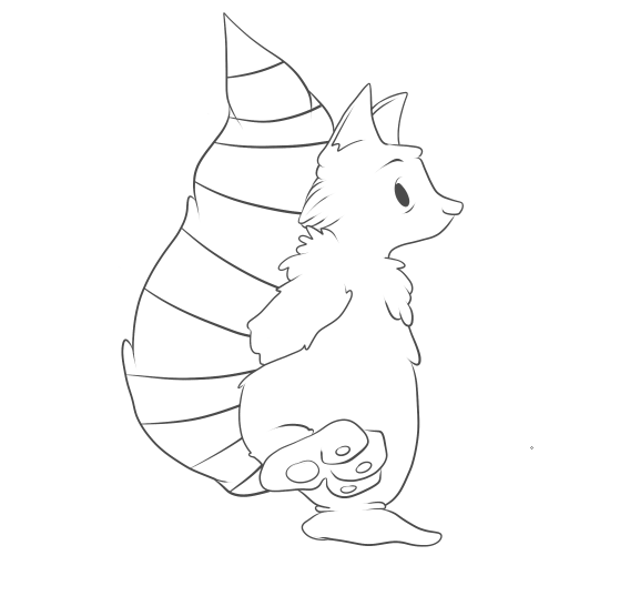
I found it a lot easier to simple draw my walk cycle images straight onto my computer, than doing them traditionally first, this saved so much time when it came to putting them all together. I used a stabilising tool on my pen work, which meant the lines would be a lot more smooth and flowing, and not sketchy like they would have come out by hand. I also chose to keep the outline of my character rather dishevelled, by changing the pressure that I applied to the pen. This made the line-work much more dramatic and somehow added a lot more character to the little raccoon, mostly by the lines being thicker at his arms and tummy, which made them seem more defined and thicker.  I didn’t have any specific difficulties when creating this walk cycle, there were minor changes to make with every frame there was to do. I did find, however, that I was able to keep the line definition the same throughout the cycle, and very easily as well, with thanks to the simple shape or my character.  Seeing as I had something as a base for my character’s walk cycle, it didn’t take me much time to complete my first walk cycle, and decided that because it had been so successful and so time efficient, I would use this loop, as an actual piece in my animation.
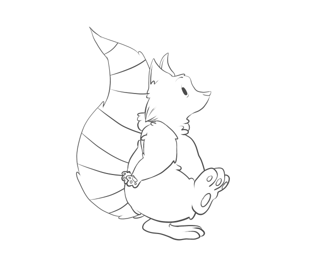


After I had created my first successful walk cycle, I decided I wanted to give it a go at colouring it;
I began by making a copy of my set of frames, and used the layering system to use colour on my individual frames, without going over the linework and ruining it. I wanted to start off using basic

colours and working my way up to doing complicated and more detailed colouring. However, I found that my characters colours were rather simple, and to try and simplify them anymore would cause them to not match the style of drawing I had done on them.
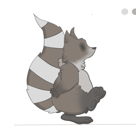
Here, it shows my first final frame that has been coloured. I used a base colour in grey/brown, then applied a light blue/white for the tail stripes and the fur on his belly and face. I used a textured brush which I edited to make look like fur, which I think worked very well on his body. I also added a dark grey to black colour on his feet, which worked very successfully and made them look a little dirty, which it turn makes him look more like a wild animal, rather than a house pet.
After I had applied all of his fur, and dark rings around his eyes to make him look both tired and more raccoon-like, I went on to create the shadow around his body. To do this, I made a new layer, turned the opacity down to about 19%, and turned the colour down to pure black. Then, with the stabiliser on max, and the pencil tool (which creates a clicked end) I went over the specific parts of his body.
This image shows in more detail how the shadow looks on the character. I think it works really well, when creating a shadow this way because of its opacity. The colours underneath are still very visible, whereas if I’d simply put a black line as the shadow it would have looked a lot less effective in my opinion. It also makes my character look a lot 3-dimensional, which brings him to life.
After I had completed all 14 of my walk frames, I then adjusted all of my images to ensure they were the same height, width and length, as my animation looked a little bit jumpy when put together.


Once I had completed a walk cycle, and applied colour, I thought it best to try and work on one of my more difficult characters. That character being Lola, the fawn friend of Archie’s, and the soon to be killer of Archie as well. I really struggled with putting together an idea of how to make her walk, as I

haven’t ever really drawn deer that much, due to their complicated bodies and stances. So I sought help from gifs of Bambi, which I then broke down and used as bases for my own character! I found this way to be so helpful, and I quickly picked up the specific body parts and areas which would need most defining and emphasis, like I did with my first loop. I didn’t copy the cycle too accurately in this image, as they depict a fully gown deer walking, and I wanted to add the cautiousness and speed of a young fawn.
I found that using the pen tool, again, gave the sleek edge and soft lines that I wanted for this picture, as deer are seen as elegant creatures. I also found it rather challenging to keep an eye on what leg was moving where, and to ensure that I didn’t mess up the walk cycle. I probably could have made it easier for myself by shading or marking one of the front and back legs, to distinguish them from each other.
However, I persevered, and was able to create a full, and working, 20 frame cycle, which shows the deer cautiously walking forward. I added a tiny bit of a head dip to my character, which is JUST noticeable, but I didn’t want to create too much of a fuss with parts of the body other than the legs at the moment. One thing that did bug me about this walk cycle was that the images seemed to get bigger as the frames went on, which is probably down to my poor tracing skills. I managed to correct this by taking each individual frame and used the transform tool to make every single one of them the same size.
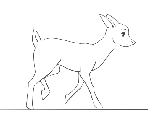
This walk cycle, I feel, took a lot more time and concentration than my first loop, simply because of the amount of body parts I had to control.  I feel as though I could easily apply colour to this cycle now, and try and work how the shadows would change as the character moves as well. And I also intend to use this cycle as a base for when I turn my fawn into a zombie like creature, were I can use each frame and edit it to my liking.


Once I had finished my first deer walk cycle, I then went on to using it as a base for the horrific makeover it was about to get;
I started off by drawing a simple line on my canvas, to ensure that all the frames were going to be the same size and I wouldn’t somehow make them all bigger as the frames go on.


I then copied and pasted one frame at a time, adjusting the size so that the character situated itself perfectly on the line. I then “went to town” on erasing parts of the body, and filling them in with different, horrific injuries that I plan on giving to the deer.
I started off with rather simple things, I added bags under her eyes to signify that she had become part of the nocturnal forest, much like her friend the raccoon. I then added a few drops of…whatever was eating her from the inside out, on her mouth and then added bits of the substance dripping from her mouth and swinging in a very mucus-like fashion. Although I’m aware that deer don’t really have eyebrows, or most artists try and blend them into their facial furry features, I altered hers to make her look more angry and demonic than before, and although the eyebrow looks rather placid in this image, it gradually becomes scarier as the frames go on.

I then went on to taking actual chunks out of her body. I knew from the moment I decided that she would “turn,” that I not only wanted to have parts of her body missing, I also wanted her to gain body parts, growths, tumours, boils – those kinds of things. So the gunge that’s eating her from the inside out, finally made an appearance and is shown to be dripping down her neck, were her windpipe and throat would be, I think this looks great, really effective and is actually not nice to look at, rather than making her still look cute with half her body missing, which is a common thing among this genre of animation.
After spending so much time working with her legs, I was a little apprehensive about changing them in any way, but one idea I did have, which kept her leg shape well, was to have a bone sticking out of one of the joints in her front and back legs. I drew a rather crude looking bone sticking out of the joint in her front leg, which looks rather horrible, along with the blood trailing down her leg to add to it. I also made her body lower itself, and go into a little dipping motion when it was time to put pressure on the leg, which I think will make it look a lot more effective and consistent with the frames.
After adding extra bones and effective the movement of my character, I then went on to make the biggest impact of my character;
I decided that to make my character a little bit more 3-dimensional, and I did this by removing almost half a side of my entire character. I wanted to have some ribs and organs showing, as well as making the skin look like it was peeling or dissolving away due to the substance inside of her. Although I want the skin to recede slowly, so I started off with a few cracks and splits in her skin, which I want to develop into larger splits and tears. Showing the ribs was easy enough, as I simple just had three separate spaces which curved down to meet the joint in her front leg.


I then went on to add multiple creases in the edges of her joints and skin. I think this makes the character look a lot more run down, almost as if she was sagging due to the nature of her health. I also added a kind of splat effect print on her hip, I think it kind of lightens the mood on the animation, as I don’t want this animation to be completely horrific! And the creases I think work so well, making her look so much more decrepit and shows just how much she is falling apart, and I also added a graze to the skin on her back leg, just so I could tell the difference between the legs.
The final product of my first frame of this walk cycle looks like this; I am very pleased with the detail I have managed to put into her and how I was able to make her health deteriorate steadily the more she moves. I have adjusted the majority of the frames to ensure that all of them are the same size and have went through her run cycle to make sure that the leg works well also, as I have intended to make it look as though it is limp when she runs. I then applied this to all 20 frames of my original walk cycle.


FINAL OUTCOMES:


Evaluation.
One a whole, I am really pleased with how all of my walk cycles have turned out. I used a digital format to create all of my frames and loops, which I haven’t done before, and experimented with making a gradual change to my character through the loop as well, which required a lot of attention to detail. I think I struggled slightly with keeping my frames all the same size and shape, because I was tracing and tracing and tracing an image constantly, and a result of this problem was the size of the deer's head changing and morphing slightly when in real life it would stick to the same size.
 If I were to do anything different, I would try and trace out all the frames by hand first, to ensure that they were all the same size, and would also have the much smoother and sleeker lines that my hand-done pieces tends to have.