Thursday, 27 February 2014

Amy Sol; Wreath, (2012.)


Another piece of work created by Amy Sol, which caught my eye instantly, was her 2012 piece entitled “Wreath.” I feel this piece relates to, or could be slightly based off children’s’ stories, when looking at all the delicately produced animals and their simple and content expressions, as when most animals are produced or included in artwork, they are passed off as aggressive and mighty beasts.
The style of this piece is very subtle and gentle, which is helped by a very subtle background, the layout and placement of each individual pieces on this image work in favour of a soft and gentle nature as well, mainly because of the idea of a circle having no sharp edges. Also, the circle would metaphorically insinuate that everything would live together and connect through some sort of mutual kindness.
The techniques used in this piece are very simple. Is it a sketched out piece, later filled in with great detail, all in pencils of different thickness's and densities. I feel as though this aspect would inspire me and help my skills vastly, mainly because of the previously mentioned problem I have with my colouring ability. And I feel that using only pencil or even pen would work very well until I was at a stage where I felt comfortable showing off my perfected technique of colouring.

Another aspect of this image that would benefit my skills in the long run would be presentation. I feel as though my work is very predictable when it comes to layout, and sometimes having constant dynamic poses doesn’t always fit best with my work, and I feel that using this kind of layout would let me get so much more into my pieces of artwork, and bind them all together in a very effective way. As opposed to having random characters just lying around the page and not looking as though they are truly interacting with each other. 

Monday, 24 February 2014

Project 4: Week 5 Plan - 24/02/14

Project 4: Compositing.
For this project I have been given the task of developing my animation, compositing and editing skills which will inform my studio practice. This will involve me animating and compositing elements to form a concise series of 3 idents for an intended use of broadcasting. 

Monday, 24th of February:
This week I will be concentrating on creating my 3 idents, as I have all the components ready for them to be made.


Days:
Monday 
24th
Tuesday 
25thth
Wednesday 26th
Thursday 
27th
Friday 
28th
Saturday
1st
Sunday 
2nd
Work to Complete
Back up files all onto Portable Hard Drive.  
Upload all of my assets to After Effects and begin first ident!
Finish first ident and render out 5 seconds. 
Upload all of my assets to After Effects and begin filming second ident! 
CAD session and update blog. Finish filming 2nd ident and begin 3rd.

Documentation
Reflection.

Sunday, 23 February 2014

Project 4: Week 4 Reflections.

Week 4 Reflections.


Days:
Monday 
17th
Tuesday 
18th
Wednesday 19th
Thursday 
20th
Friday 
21st
Saturday
22nd
Sunday 
23rd
Work to Complete
Finish documentation on mock stills. 
CAD session on how to make abstract shapes in C4D
Continue making shapes using the techniques Paul taught us.
Shoot footage based on what emotions I have chosen. 
CAD session and update blog.  

Documentation
Reflection.
This week I will be taken through how to make abstract shapes and sounds in Cinema 4D using simple tools, and also go out and shoot some final footage for my idents.

Monday 17th February: - Finished all my documentation on how I made my stills. 

Tuesday 18th February:  Looked at abstract shapes and how to make them with Paul in CAD.

Wednesday 19th February: Went and made a few of my own shapes that related well to my chosen emotions.

Thursday 20th February: Went and shot film at home that I can use for my Idents. 

Friday 21st February: CAD session and update blog.

Friday, 21 February 2014

Project 4: Week 4 - Creating abstract shapes in Cinema 4D/ Evaluations.

Here, I have attempted to make an abstract shape in Cinema 4D, this process will be worked into my
footage when creating my idents. As one of the aspects of our task is to create 3D, abstract shapes which can be put into the footage, much like Kandinsky’s artwork, where the emotions given off in films can be put onto screen as shapes, colours and movements.
To begin my task of creating a simple abstract shape, I opened up Cinema 4D and went to the “Spline” tool and used it’s freehand option to draw a random squiggle on the composition, and then blew up the thickness of the shape to make it more 3D and to give it more body.  
Once I had completed this aspect, I went on to add some effectors to the shape, and one of the effects I added to the spline was “Random,” which made the image split out and spread more. And another effect that I decided to add onto the shape was the “Formula,” effect, this effect made the shape have a much softer edge. This effect also changed the way that the shape moved, when I pressed play on the timeline. I think this was a really effective thing to try out, as it made a rather still and stark shape seem much more like an organism and gave it a much more professional look rather than a generic computer-generated image.

I then went on to add some more effectors to my shape. I wanted my shape to resemble some sort of swirl, so I added the effector named “Twist,” which resembled a circular tool on the screen, and when I changed the scale, position and rotation of this circle, it would alter the vastness of the change towards the shape. It also made the shape twist, obviously, and turn into a sort of vortex which looked really effective. Although once I had done this, I realised that the shape was too close together, so to alter this I put in another effector what was named “Explosion,” so you can only guess what that did to the shape. The rules of “Explosion,” were exactly the same as the rules in “Twist,” where if a changed any value of the circle that would affect the shapes dynamics. This made the shape look much more alive and full of character.


I then went on to add music to this shape, as I wanted to see it react and move with beats of music, so I went to “MOGRAPH>EFFECTOR>SOUND,” this brought up a box where I added a music file. I then pressed play on my timeline, and it showed the shape changing and morphing to the different beats that the music was giving off which I thought looked really cool. But I then decided that I didn’t want to just have the whole shape moving at the same time. So I went to “Strength,” down the bottom of the box and clicked on “All,” here I changed it to “Step,” so that different pieces of the shape would move at different beats to the music, which looked so much better.
 
This is what my result was of this test, and over all I am happy with the outcome. The shape expands and contracts with different parts of it’s body, in time to music and I think this looks really effective, and resembles a beating heart somewhat. The “shattered” effect that this shape displays looks really edgy, and the twisted look to it also makes it look as though it’s some sort of sharp tornado.

I then went on to try and make shapes out of ready-made and 3D objects on cinema 4D, and one of these tests I did started off where I uploaded a 3D shape of the DCM logo onto a new file.
I then made sure the image was editable, and used the knife tool to create cuts across the body of the logo. These cuts would split the shape up fully into separate pieces, whilst keeping the actual shape together, so that it can be altered in many different ways depending on what the user wants. After this made sure that the editable tag was clicked off, and selected the whole piece. I did this by selecting all of the layers on the list to the right of the screen, not on the physical shape itself, to make sure that I was able to select all of the individual pieces of the logo. After I had done this, I then went on to change the shape of the logo drastically, and to do this I went to MESH>CREATE TOOLS> MATRIX EXTRUDE.
This process is usually used to create weird and wonderful shapes like the hair on someone’s head of a 3D model, as well as limbs and pretty much an

y counterpart someone can think of. In this case, I used
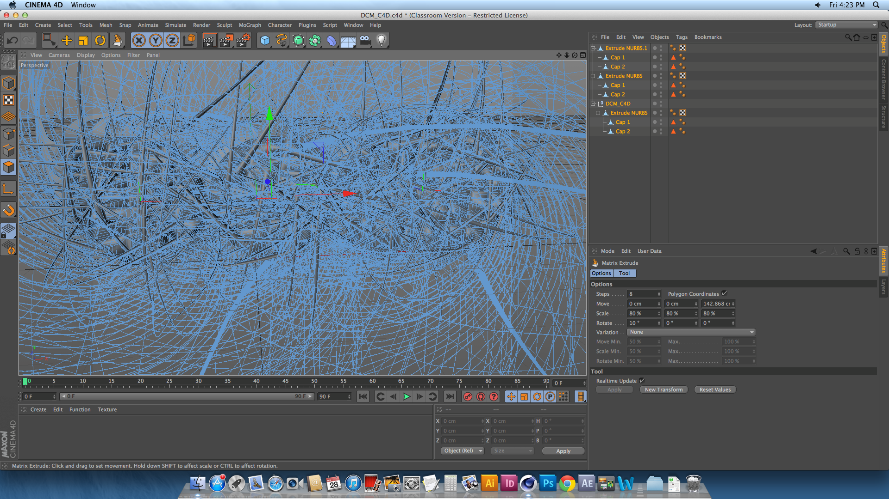
the Matrix Extrude to dynamically change the over-all image of this logo, and that is simply done by pulling the tool out and away from the shape. Once the tool is pulled away, every single part of the logo that had been cut up was the extruded and morphed into a heaping mass of spikes and shards, which looked amazing even when it hasn’t been rendered. However, once I did render the image, I was shocked as to how well it all came out. I was able to zoom out of the logo to make more sense of the state of
it.


This is what the final rendered image looks
like. Over all I’m really surprised at how easy it is to make something so simple look so effective. I love the way that each and every individual spike can be seen, and the mass of spiked curves make the image look very mechanic. Because of this, I decided that although  I could make the image look so abstract and messed up by putting in any number of colours, textures and effectors in, I decided to keep the image grey, as I really was taken to the mechanic element that I got from it. 

Monday, 17 February 2014

Project 4: Week 4 Plan - 17/02/14

Project 4: Compositing.
For this project I have been given the task of developing my animation, compositing and editing skills which will inform my studio practice. This will involve me animating and compositing elements to form a concise series of 3 idents for an intended use of broadcasting. 

Monday, 17th of February:
This week I will be taken through how to make abstract shapes and sounds in Cinema 4D using simple tools, and also go out and shoot some final footage for my idents.


Days:
Monday 17th
Tuesday 
18th
Wednesday 19th
Thursday 
20th
Friday 
21st
Saturday
22nd
Sunday 
23rd
Work to Complete
Finish documentation on mock stills. 
CAD session on how to make abstract shapes in C4D
Continue making shapes using the techniques Paul taught us.
Shoot footage based on what emotions I have chosen. 
CAD session and update blog.  

Documentation
Reflection.

Sunday, 16 February 2014

Project 4: Week 3 Reflections.

Week 3 Reflections.


Days:
Monday 10th
Tuesday 
11th
Wednesday 12th
Thursday 
13th
Friday 
14th
Saturday
15th
Sunday 
16th
Work to Complete
Render out final images of test compositing.
Take still images, and find images off internet to make mock still of ident.
Put together images using layer sequence in Photoshop. 
CAD session and update blog.  

Documentation
Reflection.
This week I will be creating my own stills in the style of the Digital Cinema Media idents, with images both of my own and from the internet. 


Monday 10th February: - I was able to render out a final Image for showing and to put into my documentation. 

Tuesday 11th February:  Took images, not scenic ones (I focused more on set ups) to use for my ident mock stills.

Wednesday 12th February: Looked on the internet for some darker images for the different emotions for my mock stills.

Thursday 13th February: Put stills together in Photoshop.

Friday 14th February: CAD session and update blog.

Friday, 14 February 2014

Project 4: Week 3 - Creating Mock Stills of DCM idents.

Using the knowledge I gained by researching DCM’s 2013 ident, I went on to make up some of my own versions using images on the internet. I decided to choose two different emotions and project them into an image based on the stills I took from the ident. I used DCM’s official logo as a template, then used Adobe Illustrator to create an exact cut out version of this. I then put this image onto Photoshop where I was able to create an almost exact replica of DCM’s stills.

The first emotion I chose was that of anger, as I thought that there would be a larger collection of those kinds of images on the internet. I chose the background image because it was such a dynamic and striking photo that would grab a lot of attention, and almost fit the emotion I wanted to portray exactly. Because of the image on the background being so dark, I knew I wanted a bright, but still an equally striking photo to go inside of the logo. I found an image of a cracked mirror, which was brilliant white in colour, but had stark black lines where the cracks had appeared. I thought that this worked really well as it not only showed the vast contrast (in colour) of the two images but also linked them together through the cracks and the dark background blending together. Almost as though the cause of the cracked mirror was the man in the background, which tells a great story when it comes to advertising.


Once my first attempt at making a still logo, in my opinion, worked out very well, so I then went onto create a second logo. I wanted this one to be the exact opposite of the previous one. I began my search looking for a warm and happy image, I wanted the image to represent a comfortable and happy state of peace. I found this image of a candle burning, and because the picture was full of oranges, browns, reds and yellows, I definitely got that warm glow and relaxed feeling from it. Going on from the warm and colourful background, I knew I wanted to add in a bright and exciting image in order to make the concept of the image more exciting and dynamic. I ended up searching for fireworks and ended up with a Catherine wheel – like picture, and because of the bright golden colour of the wheel, it makes the image look so much less static and adds so much more excitement and life to the image. I thought this worked really well as a full image, as the vast amount of emotions given off are really useful and bound to attract attention when it comes to advertising.

Monday, 10 February 2014

Project 4: Week 3 Plan - 10/02/14

Project 4: Compositing.
For this project I have been given the task of developing my animation, compositing and editing skills which will inform my studio practice. This will involve me animating and compositing elements to form a concise series of 3 idents for an intended use of broadcasting. 

Monday, 10th of February:
This week I will be creating my own stills in the style of the Digital Cinema Media idents, with images both of my own and from the internet. 


Days:
Monday 10th
Tuesday 
11th
Wednesday 12th
Thursday 
13th
Friday 
14th
Saturday
15th
Sunday 
16th
Work to Complete
Render out final images of test compositing.
Take still images, and find images off internet to make mock still of ident.
Put together images using layer sequence in Photoshop. 
CAD session and update blog.  

Documentation
Reflection.

Sunday, 9 February 2014

Project 4: Week 2 Reflections.

Week 2 Reflections.


Days:
Monday 3rd
Tuesday 
4th
Wednesday 5th
Thursday 
6th
Friday 
7th
Saturday
8th
Sunday 
9th
Work to Complete
Finish off beginnings of research.
Go out and take footage to do a mock up of compositing.. 
Take images with camera as well as footage for still compositions.
Begin session of compositing in CAD.
CAD session and update blog + compositing. 

Documentation
Reflection.
This week I will be getting all kinds of images to put into cinema 4D and use to composite shapes onto.


Monday 3rd February: - Finalised initial research and typed up in word document. 

Tuesday 4th February:  Went out around Newcastle to try and find footage to shoot, also looked for things with reflective surface.

Wednesday 5th February: Went around Berwick to look for footage to shoot, ended up shooting stuff in my garden.

Thursday 6th February: Looked up compositing on Greyscale Gorilla, edited footage down to reduce file size.

Friday 7th February: CAD session and update blog + Began to composite.


Friday, 7 February 2014

Project 4: Week 2 - Testing out Compositing on a Photograph.


he first thing I did, was set up cinema 4D, where I created a new material. I added a pre-taken photograph to the “Colour” section of the material and made sure that “Specular” was unchecked, as I didn’t was a shine to appear on a rather organic looking image. I then created a “background” piece, where I clicked and dragged the material onto its layer on the right hand side of the screen. At this point, I went on to add a camera to the composition. I adjusted the view of the camera using the small icons on the top of the screen which control the angles and viewpoints on the screen. The advice I was given when using this tool was “If it looks right, then it will be,” which gave me a bit more confidence when ensuring that this tool was in the right position. I then went onto the timeline along the bottom of the screen and added a key-frame to it using the red button with the key symbol. This was to ensure that I could move the angles around in order to edit small bits and pieces, and then still be able to go back to the original and correct viewing later on.
I then added a simple “Plane” to my composition, this would be the basis for what the abstract object would sit/cover/float over. I then went to “Panel>All Views,” to see my setup from different angles to find and manoeuvre the plane into view and in the correct location. Once my Plane was in place, I clicked on the “Projection,” which is hidden under the list in the image, and clicked on UV mapping, which make the image un-distort and become the same image that was below it. I then went just above the list and licked on “TAGS>CINEMA 4D TAGS>COMPISITING.” This brought up a selection of options, of which I made sure that “Compositing Background” and “Receive Shadows,” were active and “Cast Shadows,” wasn’t, this means that the plane wouldn’t cast any shadows onto the background, but would receive shadows off something else.
After I had completed my layout for the scene, I went onto add in a simple 3D cube and turned it onto an angle to it looked less static. I went onto “All Views,” again in order to place the cube in the correct place on my composition, and the resized/shaped it as I saw fit.
I then added a light to my composition, this was artificial light that would a substitute sun in my image. I chose to place the light to the right and slightly in front of the object, but out of sight of the camera. The
distance and size of the light, compared to the cube, would ultimately determine the shape, size and contrast of the shadow. However, I went on to edit the shadow more by clicking on the “Light,” layer an further down the page, I found the “Shadow,” option, which enabled me to choose different formats of shadow to choose from, I chose “SHADOW>SOFT,” then adjusted the density of the shadow using the scale option, which goes both under and over 100%. I also used the “Shadow Mapping,” tool to either soften or sharpen the edge of the shadow, and the higher the number, the harder the shadow would be. I adjusted all of these settings until I felt happy and was confident that the shadow looked realistic enough. As there weren’t many other shadows on the photograph to begin with, it look a little bit of time, fiddling around with these options in order to create a natural looking shadow.

Because the shadow was being cast onto a flat surface, I would have to change the shape and surface of the Plane so that the shadow looks as though it has been cast more evenly. This will also make it look as though the object I have put into my composition is an actual part of my photograph. To do this, I made sure the “Plane,” level was highlighted, and then I went onto the top right of the screen where it says “Layout,” and clicked on “Sculpting,” from the drop-down menu.

This brought up a list of things I could use to sculpt this composition, I subdivided the layer by 4, and then used the “Pull,” tool which would normally pull up bits of the layer. However, I learned that when holding CTRL, the “Pull,” tool actually pushes the layer down, to create bumps and crevices in the image. I used this tool and followed the edge of the tree trunk, along with small cracks and divides in the image, to make the shadow follow the shape of the photograph, which in turn, added a more realistic feel to the fact of the 3D object in the photo. It also made the image look much more professional, as having a completely flat shadow on such an obviously rigid object would look ridiculous. 

Wednesday, 5 February 2014

Amy Sol; Moth’s Poem, (2012.)


Amy Sol’s 2012 piece, entitled “Moth’s Poem,” was a piece that, I think, could be one of the most influential pieces I’ve seen this year. It answers so many questions and query’s that I have had about traditional work and applying the style to when working on a digital format  and being able to make sophisticated background, as that part of digital and traditional art is where I seem to have most problems.
I don’t feel there’s much of a background story to this image, and it seems to be more of a piece dedicated to just being something peaceful and serene whilst being looked at, which is another aspect that I would love to apply to my own artwork.
The image does not contain any thick black lines or sharp marks to indicate any change in character or texture, but considering how well these colours all seem to fit together, I love how they are also so contrasting from each other, so that different layers, aspects and characters are defined from each other so well.
Technically, this piece clearly shows the amount of time and effort put into it, not just during the production of this piece but what she has applied to the piece once it has been done. For example she shows that after she had completed the hair of her main character, having painted it in oil paint meaning it would remain wet for a long while, she was able to blend a much lighter colour into it in order to give that shine and haze, which looks so realistic and as though sunlight is poking through the many vines that surround her.

I feel as though this piece’s main influence on me would be backgrounds. I have the most trouble when it comes to artwork, with backgrounds as I never feel confident enough to go create/ produce an outlined piece of work with a background in it. However using this image has made me realize that simplicity could well be the key to me starting off my background artwork, which in turn has given me a lot more confidence!
Another aspect of this image that I would take away and apply to my own work would be colour schemes. I always feel as though my work looks a lot better when it’s simply lined out, instead of having colour on them, and for some reason never am able to find the colours that fit together, however I’ve found that pencil and paints go in an order of shades of colours, may well help my skills when it comes to colouring my work.

Monday, 3 February 2014

Project 4: Week 2 Plan - 03/02/14

Project 4: Compositing.
For this project I have been given the task of developing my animation, compositing and editing skills which will inform my studio practice. This will involve me animating and compositing elements to form a concise series of 3 idents for an intended use of broadcasting. 

Monday, 3rd of February:
This week I will be brain storming as to what kind of emotions I want to base my 3 idents on, and begin sessions on compositing, as well as taking my own footage to composite on. 


Days:
Monday 3rd
Tuesday 
4th
Wednesday 5th
Thursday 
6th
Friday 
7th
Saturday
8th
Sunday 
9th
Work to Complete
Finish off beginnings of research.
Go out and take footage to do a mock up of compositing.. 
Take images with camera as well as footage for still compositions.
Begin session of compositing in CAD.
CAD session and update blog + compositing. 

Documentation
Reflection.

Sunday, 2 February 2014

Project 4: Week 1 Reflections.

Week 1 Reflections.


Days:
Monday 27th
Tuesday 
28th
Wednesday 29th
Thursday 
30th
Friday 
31st
Saturday
1st
Sunday 
2nd
Work to Complete
Brief intro and looking into Digital Cinema Media. 
Look into and research existing DCM idents - look at last years. 
CAD session and update blog.

Documentation
Reflection.
This week I will be brain storming as to what kind of emotions I want to base my 3 idents on, and will be looking into already-made idents of a similar nature. 

Monday 27thth January: -

Tuesday 28thth January: We were introduced to the module and looked through Digital Cinema Media in a general sense.

Wednesday 29thth January: Had a look at existing Digital Cinema Media work and adverts.

Thursday 30thth January: Research and analyse Digital Cinema Media and frames from last years ident. 

Friday 31st January: CAD session and update blog.