In Preparation of creating my walk cycle loops for my final animation,
I began by studying and
researching various ways that characters walk, and
taking into consideration my characters weight, height and specific body parts
which would have to be catered for. I searched through a vast amount of walk
cycles and character designs, until I got to this little gem.
It seemed as though
this walk cycle was perfect to help base my characters walk, for a number of
reasons. The main one relating to the fact that I wanted my character to be
rather short and podgy, and this little bird’s body was rather similar to what
I had in mind. I also found that as I was drawing up my own characters body,
based on this walk cycle, his belly would move from side to side, as if drawing
all attention to it, and making it seem even bigger than it was.
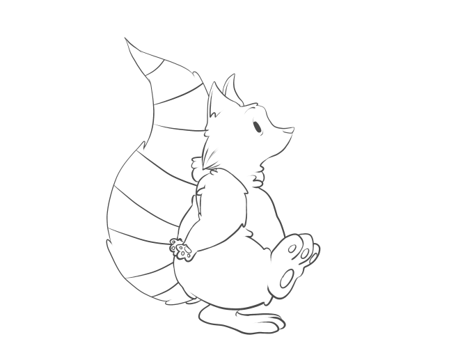
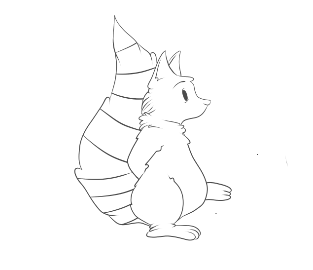
 I found it a lot easier to simple draw my walk cycle images straight
onto my computer, than doing them traditionally first, this saved so much time
when it came to putting them all together. I used a stabilising tool on my pen
work, which meant the lines would be a lot more smooth and flowing, and not
sketchy like they would have come out by hand. I also chose to keep the outline
of my character rather dishevelled, by changing the pressure that I applied to
the pen. This made the line-work much more dramatic and somehow added a lot
more character to the little raccoon, mostly by the lines being thicker at his
arms and tummy, which made them seem more defined and thicker. I didn’t have any
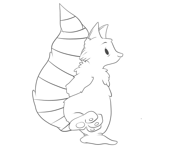
specific difficulties when creating this walk cycle, there were minor changes
to make with every frame there was to do. I did find, however, that I was able
to keep the line definition the same throughout the cycle, and very easily as
well, with thanks to the simple shape or my character. Seeing as I had something as a base for my
character’s walk cycle, it didn’t take me much time to complete my first walk
cycle, and decided that because it had been so successful and so time
efficient, I would use this loop, as an actual piece in my animation.
I found it a lot easier to simple draw my walk cycle images straight
onto my computer, than doing them traditionally first, this saved so much time
when it came to putting them all together. I used a stabilising tool on my pen
work, which meant the lines would be a lot more smooth and flowing, and not
sketchy like they would have come out by hand. I also chose to keep the outline
of my character rather dishevelled, by changing the pressure that I applied to
the pen. This made the line-work much more dramatic and somehow added a lot
more character to the little raccoon, mostly by the lines being thicker at his
arms and tummy, which made them seem more defined and thicker. I didn’t have any
specific difficulties when creating this walk cycle, there were minor changes
to make with every frame there was to do. I did find, however, that I was able
to keep the line definition the same throughout the cycle, and very easily as
well, with thanks to the simple shape or my character. Seeing as I had something as a base for my
character’s walk cycle, it didn’t take me much time to complete my first walk
cycle, and decided that because it had been so successful and so time
efficient, I would use this loop, as an actual piece in my animation.
After I had created my
first successful walk cycle, I decided I wanted to give it a go at colouring
it;
 I began by
making a copy of my set of frames, and used the layering system to use colour
on my individual frames, without going over the linework and ruining it. I
wanted to start off using basic
I began by
making a copy of my set of frames, and used the layering system to use colour
on my individual frames, without going over the linework and ruining it. I
wanted to start off using basic
colours and working my way up to doing
complicated and more detailed colouring. However, I found that my characters
colours were rather simple, and to try and simplify them anymore would cause
them to not match the style of drawing I had done on them.
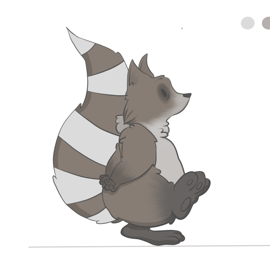
Here, it shows my first
final frame that has been coloured. I used a base colour in grey/brown, then
applied a light blue/white for the tail stripes and the fur on his belly and
face. I used a textured brush which I edited to make look like fur, which I
think worked very well on his body. I also added a dark grey to black colour on
his feet, which worked very successfully and made them look a little dirty,
which it turn makes him look more like a wild animal, rather than a house pet.
 After I had
applied all of his fur, and dark rings around his eyes to make him look both
tired and more raccoon-like, I went on to create the shadow around his body. To
do this, I made a new layer, turned the opacity down to about 19%, and turned
the colour down to pure black. Then, with the stabiliser on max, and the pencil
tool (which creates a clicked end) I went over the specific parts of his body.
After I had
applied all of his fur, and dark rings around his eyes to make him look both
tired and more raccoon-like, I went on to create the shadow around his body. To
do this, I made a new layer, turned the opacity down to about 19%, and turned
the colour down to pure black. Then, with the stabiliser on max, and the pencil
tool (which creates a clicked end) I went over the specific parts of his body.
This image shows in more
detail how the shadow looks on the character. I think it works really well,
when creating a shadow this way because of its opacity. The colours underneath
are still very visible, whereas if I’d simply put a black line as the shadow it
would have looked a lot less effective in my opinion. It also makes my
character look a lot 3-dimensional, which brings him to life.
 After I had completed all
14 of my walk frames, I then adjusted all of my images to ensure they were the
same height, width and length, as my animation looked a little bit jumpy when
put together.
After I had completed all
14 of my walk frames, I then adjusted all of my images to ensure they were the
same height, width and length, as my animation looked a little bit jumpy when
put together.
Once
I had completed a walk cycle, and applied colour, I thought it best to try and
work on one of my more difficult characters. That character being Lola, the
fawn friend of Archie’s, and the soon to be killer of Archie as well. I really
struggled with putting together an idea of how to make her walk, as I
haven’t
ever really drawn deer that much, due to their complicated bodies and stances.
So I sought help from gifs of Bambi, which I then broke down and used as bases
for my own character! I found this way to be so helpful, and I quickly picked
up the specific body parts and areas which would need most defining and
emphasis, like I did with my first loop. I didn’t copy the cycle too accurately
in this image, as they depict a fully gown deer walking, and I wanted to add
the cautiousness and speed of a young fawn.
 I found that using the pen tool, again, gave the sleek edge and soft
lines that I wanted for this picture, as deer are seen as elegant creatures. I
also found it rather challenging to keep an eye on what leg was moving where,
and to ensure that I didn’t mess up the walk cycle. I probably could have made
it easier for myself by shading or marking one of the front and back legs, to
distinguish them from each other.
I found that using the pen tool, again, gave the sleek edge and soft
lines that I wanted for this picture, as deer are seen as elegant creatures. I
also found it rather challenging to keep an eye on what leg was moving where,
and to ensure that I didn’t mess up the walk cycle. I probably could have made
it easier for myself by shading or marking one of the front and back legs, to
distinguish them from each other.
However, I persevered,
and was able to create a full, and working, 20 frame cycle, which shows the
deer cautiously walking forward. I added a tiny bit of a head dip to my
character, which is JUST noticeable, but I didn’t want to create too much of a
fuss with parts of the body other than the legs at the moment. One thing that
did bug me about this walk cycle was that the images seemed to get bigger as
the frames went on, which is probably down to my poor tracing skills. I managed
to correct this by taking each individual frame and used the transform tool to
make every single one of them the same size.
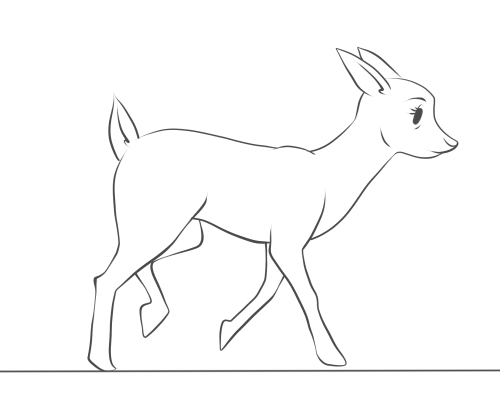
 This walk cycle, I
feel, took a lot more time and concentration than my first loop, simply because
of the amount of body parts I had to control.
I feel as though I could easily apply colour to this cycle now, and try
and work how the shadows would change as the character moves as well. And I
also intend to use this cycle as a base for when I turn my fawn into a zombie
like creature, were I can use each frame and edit it to my liking.
This walk cycle, I
feel, took a lot more time and concentration than my first loop, simply because
of the amount of body parts I had to control.
I feel as though I could easily apply colour to this cycle now, and try
and work how the shadows would change as the character moves as well. And I
also intend to use this cycle as a base for when I turn my fawn into a zombie
like creature, were I can use each frame and edit it to my liking.
Once I had finished my
first deer walk cycle, I then went on to using it as a base for the horrific
makeover it was about to get;
I started off by drawing a simple line on my
canvas, to ensure that all the frames were going to be the same size and I
wouldn’t somehow make them all bigger as the frames go on.
I then copied and
pasted one frame at a time, adjusting the size so that the character situated
itself perfectly on the line. I then “went to town” on erasing parts of the
body, and filling them in with different, horrific injuries that I plan on
giving to the deer.
 I started off with rather simple things, I added bags under her eyes to
signify that she had become part of the nocturnal forest, much like her friend
the raccoon. I then added a few drops of…whatever was eating her from the
inside out, on her mouth and then added bits of the substance dripping from her
mouth and swinging in a very mucus-like fashion. Although I’m aware that deer
don’t really have eyebrows, or most artists try and blend them into their
facial furry features, I altered hers to make her look more angry and demonic
than before, and although the eyebrow looks rather placid in this image, it
gradually becomes scarier as the frames go on.
I started off with rather simple things, I added bags under her eyes to
signify that she had become part of the nocturnal forest, much like her friend
the raccoon. I then added a few drops of…whatever was eating her from the
inside out, on her mouth and then added bits of the substance dripping from her
mouth and swinging in a very mucus-like fashion. Although I’m aware that deer
don’t really have eyebrows, or most artists try and blend them into their
facial furry features, I altered hers to make her look more angry and demonic
than before, and although the eyebrow looks rather placid in this image, it
gradually becomes scarier as the frames go on.
 I then went on to taking actual chunks out of her body. I knew from the
moment I decided that she would “turn,” that I not only wanted to have parts of
her body missing, I also wanted her to gain body parts, growths, tumours, boils
– those kinds of things. So the gunge that’s eating her from the inside out,
finally made an appearance and is shown to be dripping down her neck, were her
windpipe and throat would be, I think this looks great, really effective and is
actually not nice to look at, rather than making her still look cute with half
her body missing, which is a common thing among this genre of animation.
I then went on to taking actual chunks out of her body. I knew from the
moment I decided that she would “turn,” that I not only wanted to have parts of
her body missing, I also wanted her to gain body parts, growths, tumours, boils
– those kinds of things. So the gunge that’s eating her from the inside out,
finally made an appearance and is shown to be dripping down her neck, were her
windpipe and throat would be, I think this looks great, really effective and is
actually not nice to look at, rather than making her still look cute with half
her body missing, which is a common thing among this genre of animation.
 After spending so much time working with her legs, I was a little
apprehensive about changing them in any way, but one idea I did have, which
kept her leg shape well, was to have a bone sticking out of one of the joints
in her front and back legs. I drew a rather crude looking bone sticking out of
the joint in her front leg, which looks rather horrible, along with the blood
trailing down her leg to add to it. I also made her body lower itself, and go
into a little dipping motion when it was time to put pressure on the leg, which
I think will make it look a lot more effective and consistent with the frames.
After spending so much time working with her legs, I was a little
apprehensive about changing them in any way, but one idea I did have, which
kept her leg shape well, was to have a bone sticking out of one of the joints
in her front and back legs. I drew a rather crude looking bone sticking out of
the joint in her front leg, which looks rather horrible, along with the blood
trailing down her leg to add to it. I also made her body lower itself, and go
into a little dipping motion when it was time to put pressure on the leg, which
I think will make it look a lot more effective and consistent with the frames.
After adding extra bones and effective the
movement of my character, I then went on to make the biggest impact of my
character;
I decided that to make
my character a little bit more 3-dimensional, and I did this by removing almost
half a side of my entire character. I wanted to have some ribs and organs
showing, as well as making the skin look like it was peeling or dissolving away
due to the substance inside of her. Although I want the skin to recede slowly,
so I started off with a few cracks and splits in her skin, which I want to
develop into larger splits and tears. Showing the ribs was easy enough, as I
simple just had three separate spaces which curved down to meet the joint in
her front leg.
I then went on to add multiple creases in the edges of her joints and
skin. I think this makes the character look a lot more run down, almost as if
she was sagging due to the nature of her health. I also added a kind of splat
effect print on her hip, I think it kind of lightens the mood on the animation,
as I don’t want this animation to be completely horrific! And the creases I
think work so well, making her look so much more decrepit and shows just how
much she is falling apart, and I also added a graze to the skin on her back
leg, just so I could tell the difference between the legs.
 The final product of
my first frame of this walk cycle looks like this; I am very pleased with the
detail I have managed to put into her and how I was able to make her health
deteriorate steadily the more she moves. I have adjusted the majority of the
frames to ensure that all of them are the same size and have went through her
run cycle to make sure that the leg works well also, as I have intended to make
it look as though it is limp when she runs. I then applied this to all 20
frames of my original walk cycle.
The final product of
my first frame of this walk cycle looks like this; I am very pleased with the
detail I have managed to put into her and how I was able to make her health
deteriorate steadily the more she moves. I have adjusted the majority of the
frames to ensure that all of them are the same size and have went through her
run cycle to make sure that the leg works well also, as I have intended to make
it look as though it is limp when she runs. I then applied this to all 20
frames of my original walk cycle.
FINAL OUTCOMES:
Evaluation.
One a whole, I am really pleased with how all of my walk cycles have turned out. I used a digital format to create all of my frames and loops, which I haven’t done before, and experimented with making a gradual change to my character through the loop as well, which required a lot of attention to detail. I think I struggled slightly with keeping my frames all the same size and shape, because I was tracing and tracing and tracing an image constantly, and a result of this problem was the size of the deer's head changing and morphing slightly when in real life it would stick to the same size.
If I were to do anything different, I would try and trace out all the frames by hand first, to ensure that they were all the same size, and would also have the much smoother and sleeker lines that my hand-done pieces tends to have.


