Panda
Panther.
Since
its birth in 2007, panda panther has been revolutionising animation and
techniques of design because of their ability to develop characters via their
design and movement.
Panda
Panther are currently based in New York City, and handle a wide range of
commercial customers and animation projects which use some of the latest 3D
technologies and techniques. These technologies range from some projects being
entirely made out of CG effects, to others being developed from simple
sketches, sculpted into 3D specimens, then photographed and scanned into a
digital 3D world.
Skylanders
Menace; Spyro’s Adventure and Kellogg’s Corn Pops.
These
two animations are quite similar when it comes to the style of the animation;
There
is a very organic feel to them even though they are fiction, but are set in or
based on natural surroundings similar to a forest, maintain region. In the case
of Skylanders Menace; Spyro’s
Adventure,” the sets have been drawn and sketched with great detail, then
made into miniature sets which are then filmed and put into a CG computer
programme. This adds definition to them and allows the animators to change
morph and add any special effects to them, which includes making them float in
clouds, or grow like natural plants.
In
the case of “Kellogg’s Corn Pops,”
there is also a dragon, just like “Spyro,”
that has been detailed heavily with the help of close up studies of reptiles,
concentrating on scales, shine and slender movements. These characters have
been developed and sculpted in a 3D based computer software (very similar to
that of Cinema 4D or 3DS MAX. it is also very plausible that the characters
were animated in that same programme, where animators have the ability to morph
and change the characters emotions and body language as well as film the entire
animation in the process.
There
are a number of ways that the animations can receive lighting. The first would
be easiest to do in a software programme (much like Cinema 4D/3DS MAX,) where
lighting effects can be created.
Another one of these techniques used is
through the simple process of creating spotlights, using lamps with a specific
circumference of the shade and direct light to a specific object or scene (If
there is a small circumference,) and lighting a vast amount of the scene, if
not all of it at once, by using a large/no circumference on the shade of the
light. This technique would make the scene look more natural because of the
light imitating the sun. And putting coloured assotate over the bulb would set
the mood of the animation.
David
O’Reilly;
Please
Say Something.
Please
Say Something is
the 2009, 10 minute short by David O’Reilly. This animation seems so different
from most others because it does not contain the smooth edges and soft running
features that most animations try to achieve. The style of the animation is
that of a futuristic tom and jerry; 3D animation in it’s most raw form with no
textures, blurs, reflections or filters, which gives the illusion of an old
school pixelated game.
The
colours used in the animation are cold set of colours, giving the feel of
metallic and industry to it. At certain points throughout the animation there
are flashes of bright colour which would signify a change in state of some
kind.
The
animation was created on computer software, however it was stripped down to the
simplest form without it looking like an abstract minimalist. There are little
to no curves in the entire animation which makes it look a lot more
contemporary and futuristic, and I think this opens up more opportunity for the
text and noises of the animation to make more of an impact.
The
concept of this animation, I feel, is to show a modern day “Cat and Mouse,”
cartoon, but instead of showing the old fashioned outsmarting, chasing and
making amends, this animation has taken on the subject of domestic abuse, a
much more recent subject to be discussed. I felt as though this would connect
with an extremely large amount of people of all ages. The use of text in this
animation also has it’s own concept in the animation, which is to almost
separate the characters and what they are saying. In a very confusing way, the
cute, pixelated creatures use curses and idioms, giving the animation an
obvious audience of adults.
The
External World.
The
style of the animation is very much like “Please Say Something,” in the sense
that it is very much game-like. The composition and layout of the animation is
very sporadic and colourful, giving the feel for the entire content of the
animation, as it in itself does not make much sense. There are a range of
colours, all being rather contrasting to each other and being almost neon in
their shades. I fell this illuminative style shows the bright, bubbly and
humorous side of the animation.
As
with most of O’Reilly’s work, this animation is 3D. This is shown by the
animation being made on computer software. I feel that the animation isn’t as
bare and raw as “Please Say Something,” as it is not giving out as such a
strong message. The characters are well shaped, some being anatomically
correct, and others being rather insane and morphed creatures likely to be in
the nightmares of a child. Speak is used in this animation rather than text,
and I feel that it works better with the style of the animation because of the
range of characters, as creating simple noises for each individual speaker may
be hard to distinguish.
The
Concept of the animation, I feel, was to express, mock and possibly glorify the
pop artist culture, by using all these small clippings of animation. For
instance the child who comes into the art gallery shouting and banging on the
drum, is later turned into a piece of art himself, which I think stems out into
the world of abstract art, where almost anything can be made “beautiful,” and
accepted as something much more meaningful than it actually is.Symbolism is
constant throughout this animation, and there are moments obviously created to
shock the audience, for instance when the teacher is writing on the blackboard
and she turns to reveal Adolf Hitler on a cross trainer, is where her face
should be. This shows that nothing can be considered as taboo in this culture.
Themes such as racism, the Holocaust and sexual perversion are all displayed
nonchalantly as though they aren’t even remotely controversial, which I think
is symbolising much of O’Reilly’s cynicism.
Studio
A.K.A
Varmints;
The
style of this animation is almost like a documentary and animation combined. It
is a 3D world of created creatures of a dog like species. The layout of the
animation is that of a grimy, dirty city, with a lot of greys, blacks and
browns to mimic the dark and dank areas of the city, as well as the general
feelings and mood throughout the film. There are moments of light and sunshine
in the film, and I feel again, that it corresponds to the happenings and
feelings throughout the film, and all of the colours are very earthy and
natural which I think co-insides with the message behind the film.
The
characters are very well constructed. The fur on the bodies of the Varmints can
be seen almost individually and they move in a very realistic way, as opposed
to some animations that look as though the character has received a static
shock. The movements throughout the animation looks very natural, especially
with the trees and plants that have a constant sway due to the breeze, although as the animation is obviously not
meant to be believable, it does look as though it could be filmed with real
life creatures and scenery.
The
concept of the animation is not at all metaphoric, but very clever. The use of
small, cute characters appeals to a large amount of viewers and will touch the
hearts of women and children in particular. They are clever and very expressive
with their facial features and gestures, as they do not speak, and the music
added with these aspects makes the animation very effective. The use of animals
also will relate to the act of trying to conserve the plant not just for
vegetation or wildlife, but for the human population as well, and seeing the
struggle that the little fellow goes through would send a very direct message
to the viewers.
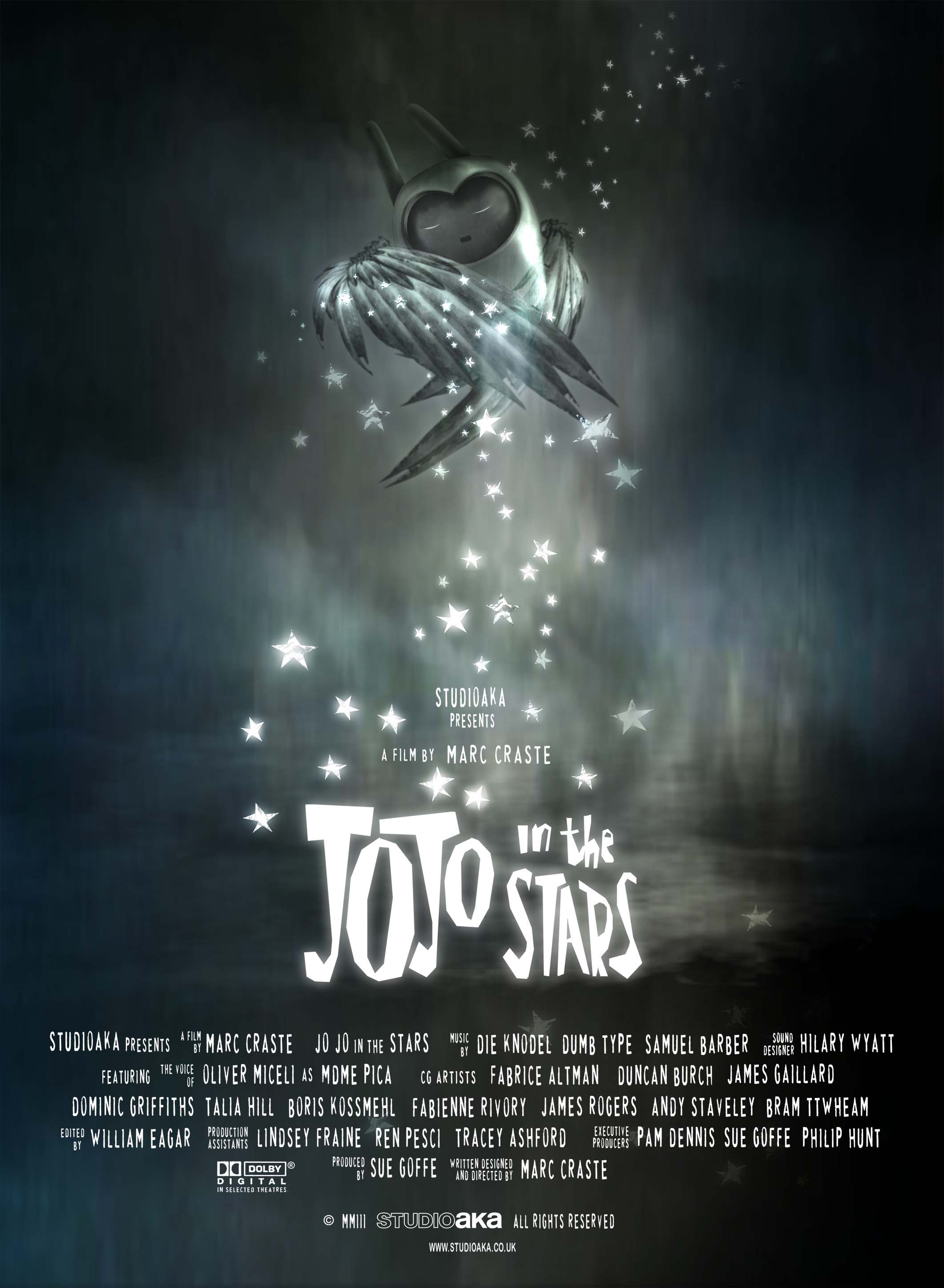
JoJo
in the Stars;
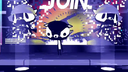
The
style of JoJo in the Stars is that of a horror/thriller animation. The use of
cute little robots, in such a dark and quite frightening scenario gives the
impression that a slightly older audience would prefer this animation. The
black and white animation uses a lot of shadows and white lights to either
frighten or comfort the audience, depending on the situation, work exceedingly
well and work to enhance any of the characters’ features.
The
animation is again 3D, using mostly rounded or square shapes to represent the
characters. There isn’t a vast amount of detail on most of the characters,
however the light and shadow enhance the shine and glare on the robots’ bodies
and faces, making them seem much more realistic because of this. The robots
don’t have any specific emotion on their faces, as their mouths are kept the
same throughout the film. Their eyes, however, show the majority of their
emotion as they can move, squint and grow to show different emotions.
The
concept of JoJo in the Stars, I think, is to tell a kind of Romeo and Juliet
styled love story. Again, as with “Varmints,” the use of small cute characters
works well with this kind of story as it doesn’t make it as menacing as it
should be. The story is very relatable
to a lot of the audience, particularly
teenage girls if stereotypes were to be included, because of the topic of
forbidden love, usually with someone famous and well known, which is also what
happens in this animation as well.
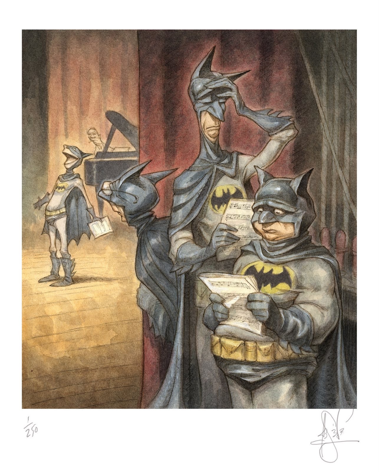 His work is easily distinguishable as many covers of "The New Yorker," and creating the lead cast of three anthropomorphic characters in "Ice Age," and has contributed amazing designs to the feature films including "Mulan," "Finding Nemo", "Tarzan" and "A Bugs Life."