My Targets for this week are to; February
Mon - 11th: Have started rigging my character, have arms legs and main body completed.
Tue - 12th: Have my character rigging should include the head and parts of the hat showing that it can move.
Wed - 13th: Have my Essay completed along with keeping up with my animation analysation (at least 5 sections completed.) And keep up with bookwork, documentation and analysation.
Thurs - 14th: Finished rigging my character by the end of the day, adding a face to my character using the point to point method.
Fri - 15th: Animate my character's walk cycle, documenting and print-screening as I go along.
Sat - 16th: Finish my Essay and animation analysis - PRINT AND BIND AT COLLEGE FOR FREE ON MONDAY 18TH.
FdA Animation Student and avid Digital Artist. Interested in the weird and wonderful, mostly weird.
Monday, 11 February 2013
Friday, 8 February 2013
My Character Board.
Here is my finalised and completed Character Board. I was asked to create a Character Board with a range of views of the Character, showing a variety of emotions and sizes of my character as well. There are a couple of things I would change about my Character Board, one of them being the size differences in the heads on the character scale, another would be the colour of the final figure on the character scale what appears to be lighter than the rest. Another change I would make is to the Character's eyes on the emotions piece of the Character Board, because they appear to be a lot darker than they need to be. Other than these minor setbacks, I am very pleased with the outcome of my Character Board, as the character contrasts highly from the background, but still manages to not clash and works greatly.
Running Cycle.
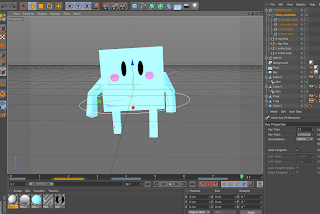
Using Numbers to Change Speed of Character:
In this project we were asked to create a mini character before starting to make our own, more complex characters. This character was used to test out a number of ways to make our more complex characters move, in ways such as running, skipping, jogging, sneaking and walking.
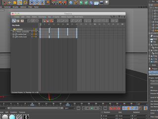 This character was set up so that the keyframes along the timeline were in the position to make him do an ordinary walking style, however we needed to use a variety of number scales, positions and movements to make him look as though he was running. This would require me to go to the "Window" tool across the top bar of the
 screen and click on "Timeline," which brought up this pop up window. This window showed me all of the keyframes in my timeline, as the timeline on the main screen only shows the keyframes of the points that have been selected, and allowed me to move them.
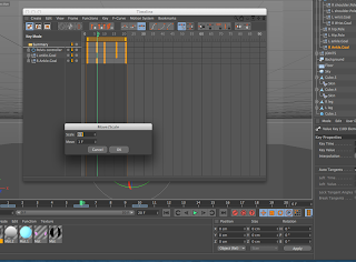 Before I made any adjustments to the position of the keyframes, I needed to use the speed of them to make my character look as though he was
running. To do this I clicked on the "Function" tab across the top of the pop up bar, and clicked
on the "Move/Scale" option fro the drop down menu, which then opened up a small box with "Move" and "Scale" options on it. I changed the "Scale" options to 0.5, in order to make the keyframes move closer together, making them seem much faster because they had been doubled in speed.
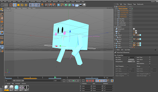 Once the speed of my character had been increased, I then went onto the moving and repositioning of my character. I did this by lowering the number of frames on the timeline from 40 to 20, and then started to move the
 "Pelvis," joint on each of the frames I thought necessary to change. These frames were the frames on "0," "4," and "9" frames, where I used the arrow move tool to lift up the characters body. This then made the character look as though he was jumping at these points, and when the cycle was played, it looked as though my character was running.
Monday, 4 February 2013
Peter de Sève ;
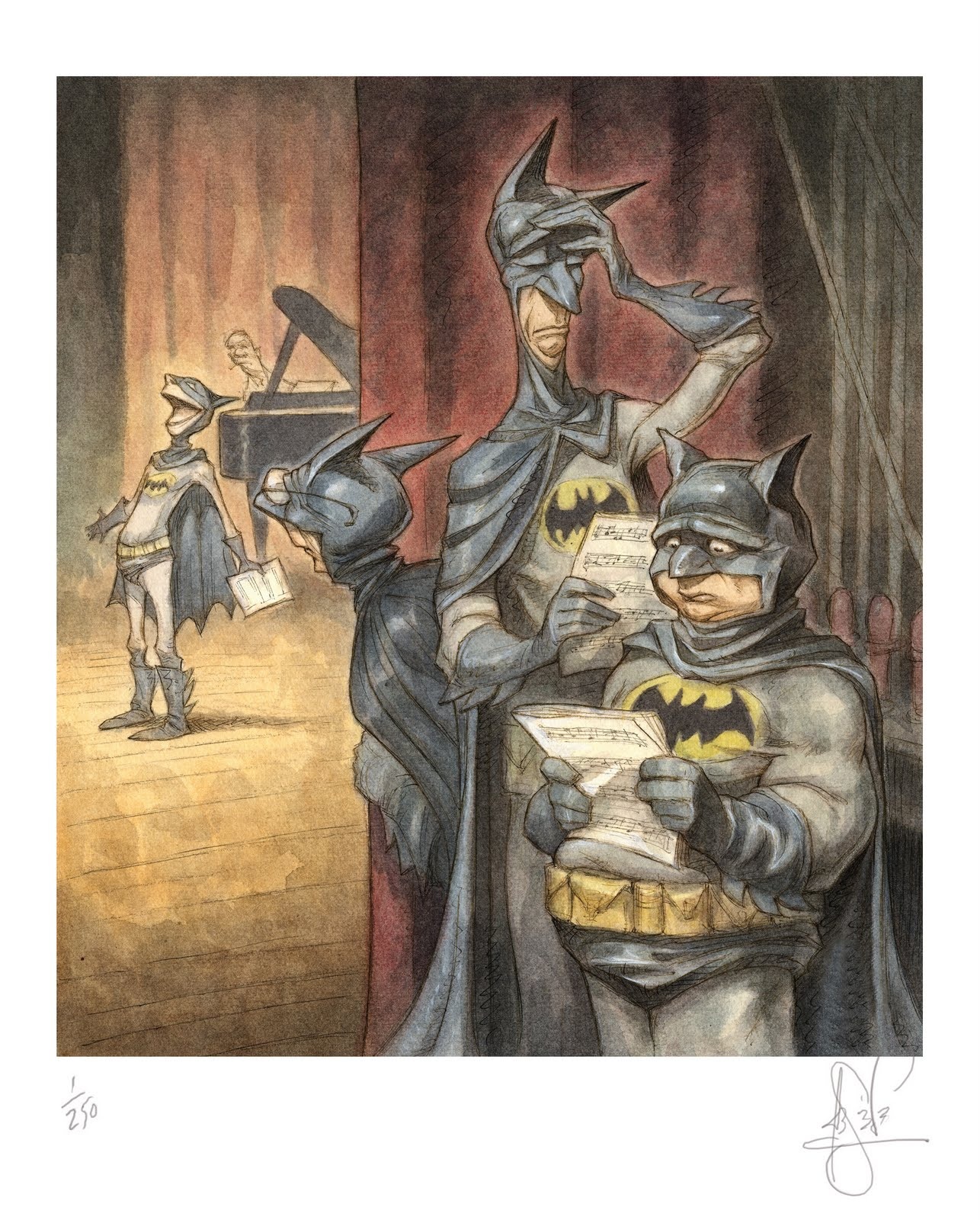 His work is easily distinguishable as many covers of "The New Yorker," and creating the lead cast of three anthropomorphic characters in "Ice Age," and has contributed amazing designs to the feature films including "Mulan," "Finding Nemo", "Tarzan" and "A Bugs Life."
De Séve's style of work spans out massively from mixing traditional work with modern characters, mostly fiction. He also applies a significant amount of humour in his work: For example his piece entitled "Batman, The Musical,"was one that caught my eye immediately, as I am a fan of Batman. He uses a wide variety of figure stances, stating that he tends to imagine the character he has created, standing in front of a "circus or fun-house mirror" in order to show them in almost the opposite way. E.g from being tall and thin, to short and fat.
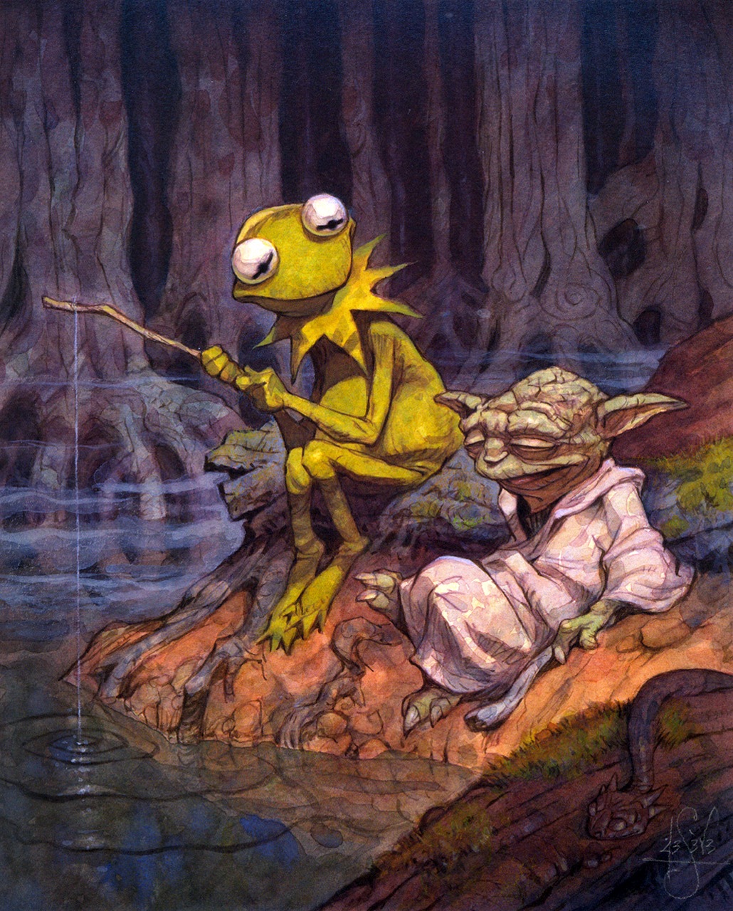
Another of de Séve's pieces that I feel, uses this technique is called "Easy Being Green, It Is Not." This illustration consists of Kermit the frog from "The Muppets," and Yoda from "Star Wars," and I believe that this image works amazingly as a piece because the characters could not be from more different worlds, yet they are sat together as if they have known each other for years!
I think this is down to de Séve's attention to detail, the delicacy which he uses to colour his images and his ability to draw facial features at such a high standard.
Sunday, 3 February 2013
Making My Character Board.
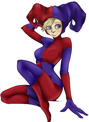
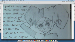 When I began making my Character Board, I took into consideration what kinds of images I would want to use. I ended up choosing a few of the more detailed and, therefore, effective images that I had created during the research and development part of my work. I chose a sitting pose to be the main part of my character board, because I would be able to make this image bigger due to her sitting down, and then in turn would allow viewers to see more of her body and face.
I began to recreate this image digitally, using Adobe Illustrator, through the means of a master class introducing the technique of using the pen/line tool. I think this was a very effective way of lining this piece of artwork, because I had complete control in what the lines were doing and in what direction they were doing it, which also made the image look more professional.
 I continued using this process until I had a
 completely lined image, to which I could add
colour, using the program Paint Too Sai. I have most confidence lining and colouring my artwork using that particular program, but I gave Illustrator a shot as I'd heard many good things about it. I added colour using the simple paint tool, then highlighted shiny areas and created shadows in more dull ones, this made the character look a lot more 3 dimensional and gave her a bit more personality such as mischievousness and loyalty. I also noticed that adding a singular line underneath her, made her look as though she was sitting on an actual object which looked very effective on the finished character board.
I then did the same technique to the other images that I put onto the character images as well. I was able to edit them into digital pieces of art in order to put them onto the character board. I chose images that I had drawn from scratch which
looked best for the character board.
One of these images was the character "emotions," image. This image fits it's purpose well because it shows ultimate emotions from my character, showing happiness, guiltiness and sadness. I think one downside of this image was that the eyes are not exactly the same shade of blue as my main character, as they are a lot darker, however I still think the image serves it's purpose well.
However, over all I'm very pleased with how my images turned out and think that the colours and designs were successful and work with the number of backgrounds that i tried them out with. There are some aspects that I feel bring it down and if I had the time I would change them, but overall I am very pleased with how they've turned out.
Subscribe to:
Comments (Atom)


